L'armonia dei Contrasti

Armonia dei Contrasti is an event dedicated to the tango with a live music performance and a themed dinner.
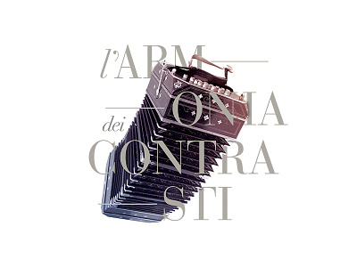
We designed the artwork, the invitation, the brochure and the menu. We aimed to transfer the concepts of harmony and contrast to graphic elements by playing with colours and the font. The choice of the blue and the red is due to the opposition between the colours. We also opted for a gradient to achieve a better harmony of the two.
In order to exacerbate the concept we picked the Bodoni, which is a good example of balance between thick and thin lines.
view more
https://goo.gl/AZyUut