Ducleaux Winery - Raucous Redesign

My wife and I love visiting the wine country in Walla Walla Valley, and we've learned so much about wine in our trips. One stand-out on our last visit was Ducleaux Cellars in the Rocks District, right across the Washington border in Oregon. When we arrived for our tasting, we were the only folks there and we got to hang out with the winemaker Toby Turlay, co-owner Chris Dukelow, and their wonderful golden retriever Stella. After an afternoon attending some other tastings in the Rocks District, it was a great wind-down to be able to sit with the actual people making this wine in their garage and just chat in a much more laid back setting while giving Stella the occasional ear scratch.
Ducleaux is unique for being a smaller operation, and for being one of very few women-led wineries in the region. On top of that - they just make some damn good wines that show off the best aspects of the unique terroir of the Rocks District without coming off as stuffy or pompous. The tagline on their website is "serious wine made by not so serious people" and I couldn't agree more, which has made it such a memorable stop during our last Walla Walla trip.
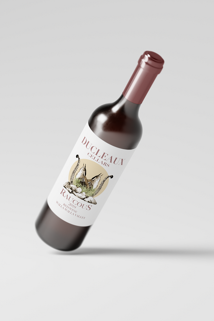
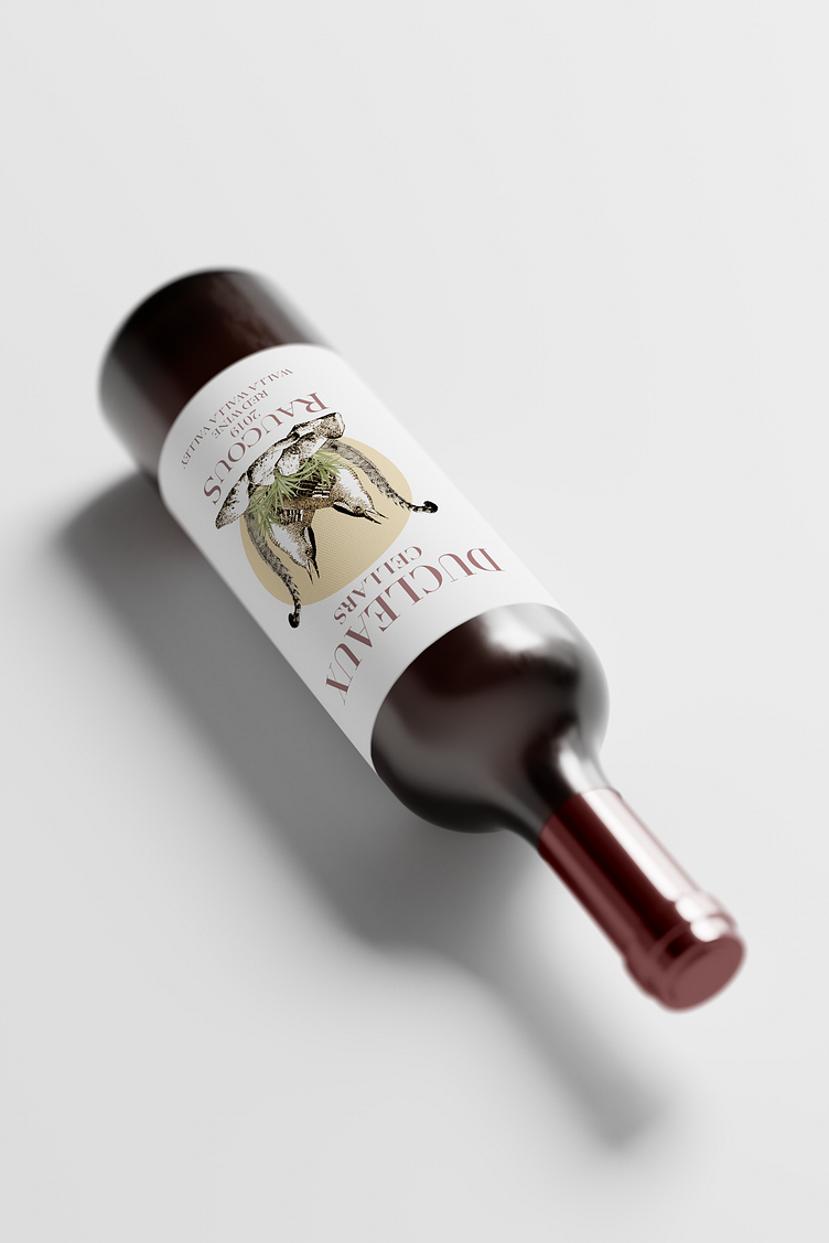
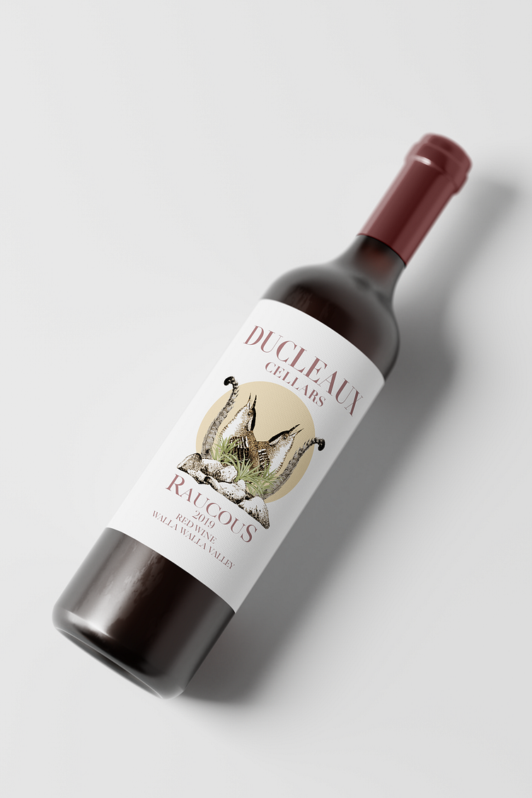
Given how much we love their wine and overall vibe (and given my interest in wine, liquor, and beer packaging), I wanted to use one of their wines as a case study for designing a wine label. Here you can find my take on their wonderful GSM blend - Raucous.
(Note: this is a personal project and not officially affiliated with the winery!)
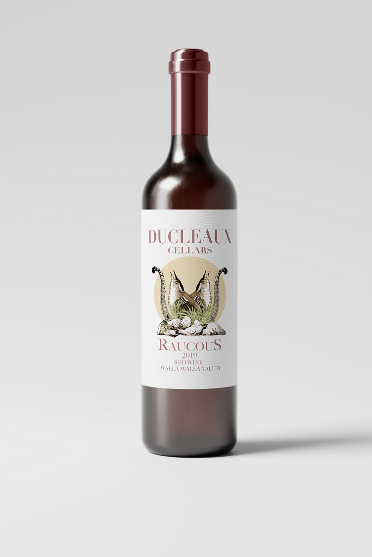
I knew I wanted to capture something a little more playful and less formal with the wine label since the winery and its owners are anything but stuffy. I liked the image of a bird with its mouth wide open, singing and causing a commotion on the label. Duplicating the bird image provided a nice symmetry that I stuck with throughout the design process. In the foreground I also wanted to include an image of stones to pay homage to the unique terroir of the Rocks District, and to visually provide some framing for the overall design. Finally, for the colors, I wanted to stick with a fairly limited palette and settled a set of hues that reminded me of the somewhat arid climate of the Walla Walla Valley while also nodding to the deep red hue of the wine with the font color.
I think the resulting label is fairly unique among other wine packaging and captures a lot of what I love about this winery and their wines! Thanks for taking a look and reading.