NFT Marketplace Case Study

INTRODUCTION:
I've been a graphic designer for over 15 years, but I've only ever worked on print materials. I've recently taken an interest in learning digital design to challenge myself and also match my design skills to where we are in this world where everything you need is right at your fingertips 📲. In my search for a beginner course in digital design, I found the UI Design 101 Course through Dribbble Academy.
In this six week course, our challenge was to create an NFT Marketplace app for a company called Moon using the tool/program Figma. I've learned a TON in the last six weeks, and while it was challenging (I asked for it 😉), it was also very rewarding! Read on to find out what I've learned!
PROJECT BRIEF:
Moon is a new and upcoming startup with the goal of revolutionizing the NFT Marketplace business with a design-first approach and a deeply curated experience for the user.
The goal of the project was to create an app with a visual aesthetic that is attractive to tech-savvy people who know their way online and in the world of crypto and NFT and who also have a strong sense of visual aesthetics and art.
In addition to creating the visual aesthetic and user experience, the client asked for the design to be scaled to multiple screens based on wireframes and flow they provided.
The project was divided into three weeks of work, the first part being research & development, followed by moodboard creation, and lastly, visual exploration.
Final deliverables for the client are: New visual language for digital art, fully designed flow, UI library and a functional Figma Prototype
MOODBOARD CREATION:
I created two moodboards to explore different ways to take the direction of the UI experience and collect visual inspiration for this project. I decided to go with two directions: one dark and techy and one that is a softer, more muted color approach.

V1: LIGHT, SOFT, BOLD TEXT
My first moodboard was a soft, light color exploration. I looked for inspiration in a lot of health-related apps to get the "soft" feel with more muted colors and larger text examples. There were a lot of illustrations and icons, but not a lot with big pictures like an NFT "card."

V2: DARK, TECHY, BRIGHT ACCENT COLOR
Moodboard two had an overall darker feel, keeping big, bold text and an accent color. A lot of the inspiration came from other NFT marketplace examples or tech-focused apps. The inspiration examples had large images, similar to something that could help showcase artwork in an NFT "card" format.
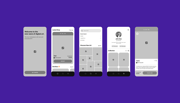
WIREFRAMES (provided by client):
VISUAL EXPLORATION:
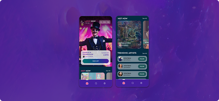
Taking the wireframes provided and the mooboards I created, I started exploring the first couple of screens. Playing around with different fonts and colors, layouts, and images (borrowed for inspiration by artists on https://foundation.app/) . I did this exercise for both moodboard so I could 1) practice using Figma and understand how to navigate the features/functions of the program, but also 2) narrow down my concepts for the final screen selection, aka moving on to the next step in the project. It was a fun exercise to see how something that has the same content, can create such a different aesthetic


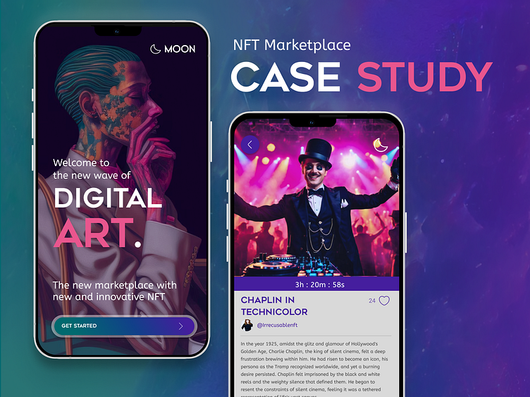
FINAL SCREENS:

I chose to move forward with the Visual Exploration Moodboard V2 - the Dark and Techy with a bold accent color because I feel like it fits the client's audience best; tech-savvy and know their way around the world of crypto and NFT. The bold colors and contrast can pair well with the artist's work while giving a strong feel for direction & navigation throughout the app. Once I moved forward with the moodboard, I finished polishing and scaling the remaining screens provided in the wireframes. I really liked the boldness of a large image for the splash screen. I feel like it captures the user's attention while showcasing an artist's talents, which is the main reason for this app. I chose to highlight some of the keywords in an accent color to help create attention and contrast on the page. Purple is my favorite color, so that's the reason I chose that as the main color; it's very visually appealing to me - probably something I wouldn't do for an actual client 😊 I chose a mix of all caps and lower case for the fonts to distinguish between the header text and sub-copy to showcase the importance of the copy.


DESIGN SYSTEM:
One of the biggest challenges for me was learning the intricacies of Figma from a Design System point of view. A design system is a main hub for all of your components like icons, buttons, etc, fonts (sizes and families), colors, etc. Creating this "system" within Figma allows you to make changes to a component and have that change be applied to all instances of that variable. It's a way to organize your design file, keep branding consistent and make workflow more efficient.

PROTOTYPING:
Goodness, this was my favorite part of the entire project! Not because it meant the class was almost over 😝 but because I learned SO much by being able to "dissect" my file to get a better understanding of how scrolling and navigation were supposed to work. Not to mention, it's REALLY cool to see all of your hard work come to fruition 🎉
On the outside, navigation can look pretty simple and intuitive, but when you look "behind the scenes," it can get pretty complex. Ensuring you have all buttons covered so that no matter what page you're on, you can get to the other pages and back to the previous one you were on. I'm excited to take the exploration further with the Search function and how to link to other artists.
WHAT I LEARNED:
Phew....it was A LOT! I started out not knowing if I had signed up for the right course - was the content going to be what I was looking for to further my career in design? And then I wondered if I was even going to be able to keep up with the schedule and homework because I'm a working mom with kids in activities...Well, I'm here to say I fully completed AND comprehend what I've learned these past six weeks!
As a designer, I knew I had the ability to create a design that would be visually appealing, it would have the right elements to "look" like it could function properly, plus, I'm a user of apps, so I had to know something about user interface and experience! Once I got into Figma, I quickly realized it was nothing like I had used before, and there's a language to digital programs that I had never heard before, so initially, the program seemed a bit intimidating. I used my homework as a time to explore the program, and I watched the recordings of our weekly mentor sessions (on top of the course content) to help me understand the program even more.
I definitely have a lot yet to learn about Figma and digital design, but I'm excited to continue my adventure with digital design and Dribbble Academy!