Motion Cache: Logo Design

This was a logo design for a start-up company called "Motion Cache." The creative goal was to create a functional word-mark and pictorial logo that come together effortlessly as one, as well as stand alone as needed for branding purposes. The products and content coming from Motion Cache are heavily focused on the topics of motion design and video games, which provides a “cache” of entertaining and educational content, as well as cool motion design assets available for purchase.
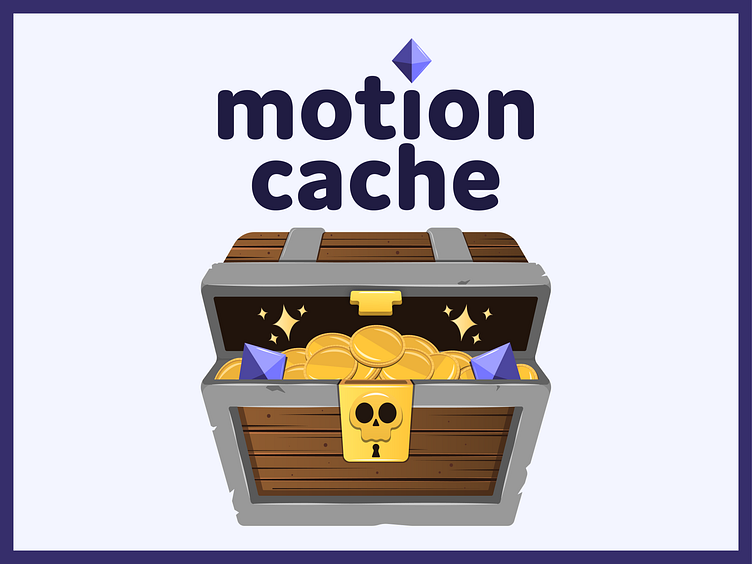
Since gaming content and motion design are the core of what Motion Cache works with, it was essential to give this logo a playful, engaging look. I went with a bold, rounded font for the word-mark logo because it is fun, and welcoming. For the “i” in motion, I wanted a piece from the pictorial logo to be incorporated into the word-mark, to keep them consistent, even when apart. It allowed for a 3-D contrast against a 2-D word-mark, which I really love (and makes me think of the Gamecube logo - a timeless classic).
The client was set on a treasure chest for this design to play on the word “cache.” This concept worked out great because it allowed me to create a clean logo that combined the modern idea of an internet cache, as well as an old-fashioned idea of a physical treasure chest. The logo also should appeal to gamers looking for game content or assets for purchase because the treasure chest is synonymous with many popular video games, and it’s a rewarding experience to find one (think The Legend of Zelda or Fortnite).
Overall, it has been great fun working with Motion Cache, establishing a logo and basic brand identity. I look forward to seeing all of their progress as their website unfolds, and would be happy to work with them again in the future!