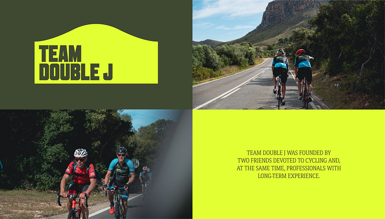
TEAM DOUBLE J - Rebranding


The initial concept was to create a corporate design for a fictional company, but I chose to take a different approach and embark on a re-design project for Team Double J, a bike shop in Mallorca. Instead of opting for the obvious choice of incorporating a bicycle into the logo, I aimed for a more abstract representation.

THE LOGO
The resulting logo features a "wave". This "wave" is formed by two lines: a straight one symbolizing the path of a road bike and a curved one representing the road of a mountain bike – both of which are the primary bicycle types at the shop – that come together as a whole.