Declutter my Inbox


Reduce the noise of the Inbox screen
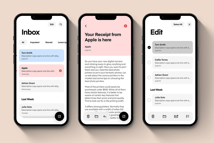
A simplified screen displays today's messages along with stacked cards of the previous week's emails similar to how Apple displays a stack of related content. This allows for an easier view of our inbox, focusing on only the emails for that day with an easy ability to expose the previous week's messages, along with more below "the fold" (2 weeks, 3 weeks, last month, etc.).
Messages marked new or of high importance are displayed in blue and red respectively. To increase accessibility and ensure all users understand the status of a message, dots to the left of the message add an additional unread affordance. Messages marked urgent/critical would have yet one more icon indicator to disclose its prominence in the inbox.
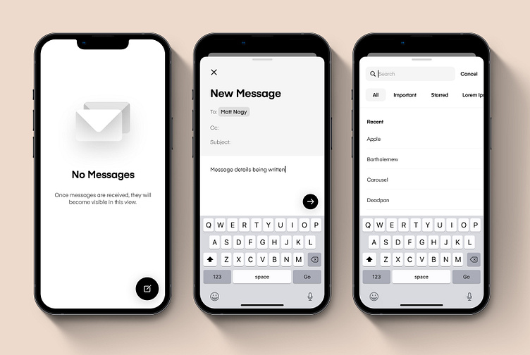
Floating action buttons and toolbars would suppress on scroll to give the user a full screen view of the page they are on.