Logo Design - Aruna's

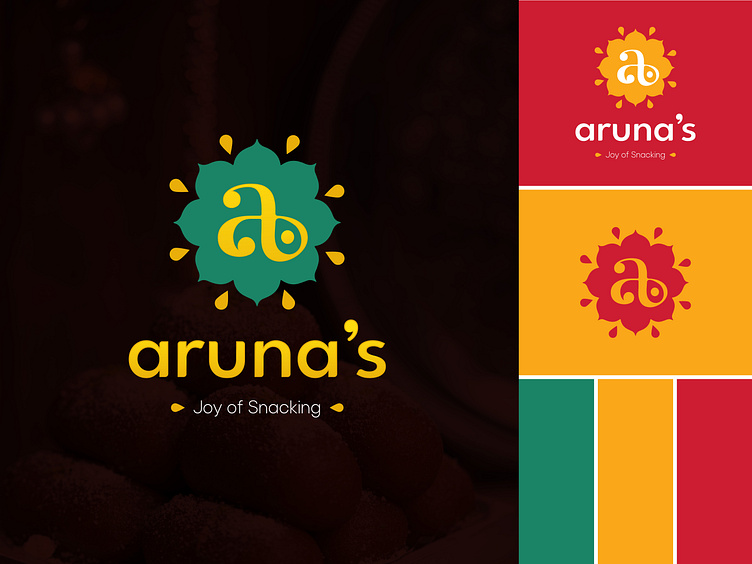
In the realm of logo design, the Aruna's logo stands as a striking testament to the fusion of tradition and authenticity. Crafted for a South Indian sweet and savory brand, this logo encapsulates the essence of South Indian culture and culinary heritage with grace and finesse.
The logo incorporates the initial of the brand 'A' in a serif font that includes a dot in a curve, a representation of kolam design. Kolams are intricate geometric patterns drawn with rice flour or chalk powder outside Indian homes as a symbol of welcome & auspiciousness.
The color palette employed is a homage to the rich and vibrant colors often seen in South Indian culture evoking a sensory connection to the dishes.
The logo embraces a simplistic approach with a letter, a dot and kolam shape in background , making it instantly recognizable and memorable. Its elegance lies in its authenticity, resonating with the straightforward preparation and genuine flavors of the brand's dishes.