Email Client

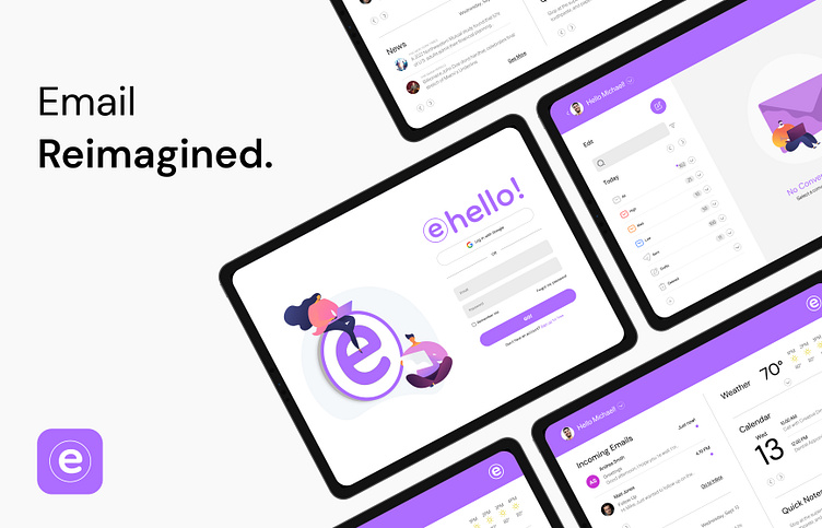
Say hello to a smarter way to manage your emails.
Overview
Email, once a workplace essential, is now viewed as inefficient in the modern work environment due to issues like overload, limited collaboration, absence of real-time messaging, and faster response capabilities.
Value Proposition
eHello! is an email client tailored for modern, deskless online entrepreneurs seeking a quicker, more efficient, and less formal approach to managing their emails and tasks. In a world where texting often takes precedence over emailing, eHello! offers automation features to reduce the time spent on emails, catering to the needs of busy individuals.
Problem & Past
Over the last few years, teams have increasingly shifted from email to team communication platforms. Freelancers are also following suit. However, constantly inviting new members to a channel for short-term engagement can be challenging. Additionally, these platforms, while beneficial in many ways, do away with some traditional email features that could be improved rather than discarded.
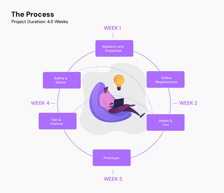
Goal & Objectives
Online entrepreneurs will begin adopting the tool, potentially reclaiming hours of their days, weeks, and years. A successful metric in this context will bring better productivity for users.
The objectives encompass, but are not confined to:
Streamlined Threaded Chat Style Email View
Efficient Canned Responses
Cutting-edge AI-Driven Suggestive Text
Smart Folders and Filters
Effective Topical Organization
Market Research
Users are increasingly gravitating towards communication platforms that offer quicker, more casual interactions. Yet, these platforms present unique challenges not entirely aligned with their needs. Combining the best of both worlds may offer an optimal solution.
Based on research, surveys, and one-on-one interviews, the following findings emerged when analyzing both, communication and email platforms:
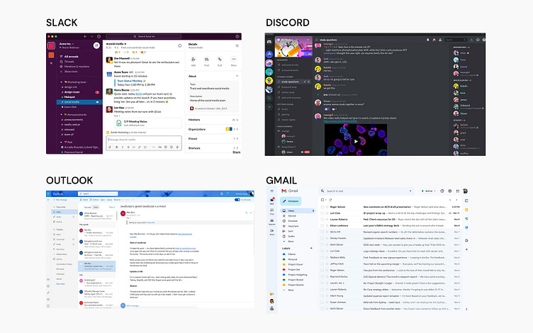
Communication Platforms (Slack, Discord)
While faster than email, setting up channels and inviting users on these platforms can hinder efficiency.
The interface looks cluttered and lacks a clear visual hierarchy.
Messages can feel disorganized and hard to follow.
Catching up on conversations can be a hassle due to its fast, chat-focused nature.
These platforms lack some essential features that provide a more concise, chronological order.
Traditional Email Platforms (Gmail, Outlook)
Emails can lead to overload, with some messages going unread or difficult to find and categorize.
Emails lack a personal touch; certain messages are best conveyed verbally or texted, rather than through formal emails.
Emails can disrupt work by requiring a long time for review and to respond.
Spam, viruses, data protection, and other technical-related issues.
The interface looks clunky and overwhelming.
Too many features that are confusing and unnecessary.
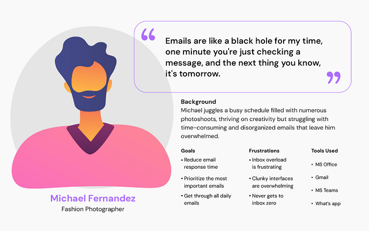
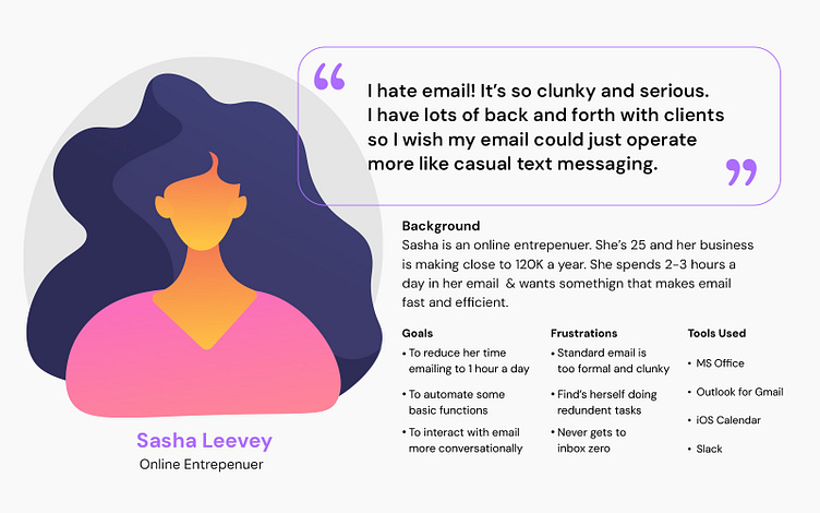
User Personas
After analyzing motivations, the primary one is the pursuit of fast and efficient solutions to save time and reduce stress, pinpointing the root problem. I focused on two personas, emphasizing key needs: a user-friendly interface featuring a threaded chat-style view for effortless message management, coupled with advanced filtering and categorization functions for improved efficiency.
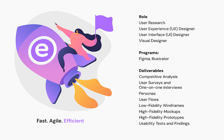
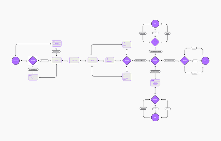
User Flows
I developed these user flows with a focus on aligning them with the objectives and goals, effectively highlighting the primary user paths for swiftly and efficiently accessing and sending emails.
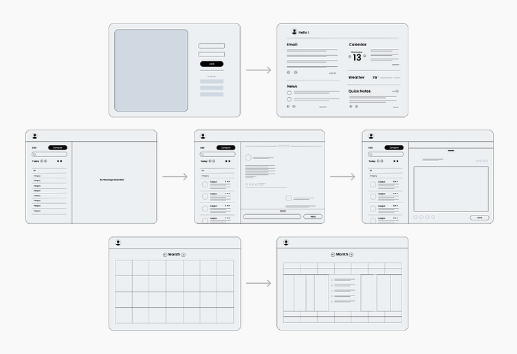
Wireframes
Before diving into a more structured low-fidelity wireframing, I prefer to initiate my ideation process with quick sketches. These sketches are crafted while considering the requirements, research findings, and user persona, portraying a visual representation of the potential appearance of the primary email client screens.
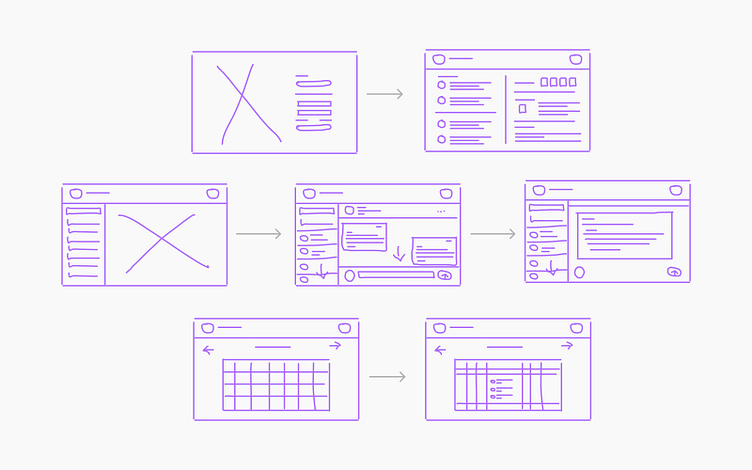
Low-Fidelity Wireframes
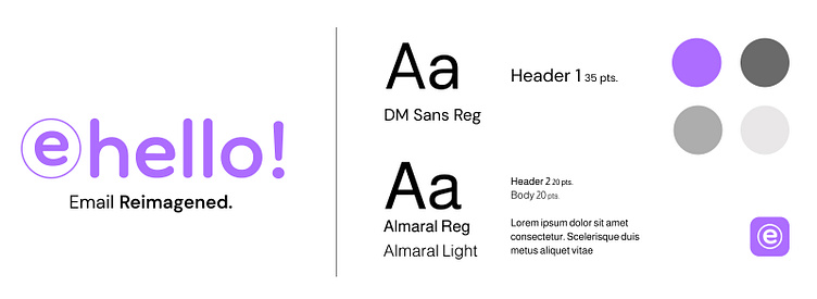
Visual Design
The central objective of the overall visual design is to ensure a user-friendly and clutter-free interface, facilitating effortless navigation through the app. To enhance the visual appeal and establish a sense of sophistication, I have chosen purple as the primary color. Purple is often associated with high-end products, making it an ideal choice. Moreover, this color harmoniously blends with the overall visual scheme, contributing to a cohesive and pleasing user experience.
High-Fidelity Mockups
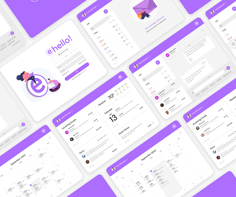
High-Fidelity Prototyping
Dashboard Key Features
Prioritized Incoming Email Preview
Easy, Scrollable Previews
Live Newsfeed and Calendar Integration
Expandable Weather Forecast and Quick Notes Integration
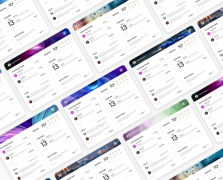
Personalized Header Background Images
Email Key Features
A Clutter-free & Streamlined Interface
Visual Hierarchy-Centric Categorization
Streamlined Threaded Chat Style Email View
Expandable Messaging Text Box for Brief or Detailed Messages
Optimized Personalized Pre-Written or Canned Responses
Cutting-edge AI-Driven Suggestive Text
Smart Folders and Filters
Effective Topical Organization
Calendar & Newsfeed Key Features
A Clean & Sleek Interface
Effortless Feature Management with Expandable Functionality
Simplified Access with a Single-Screen, Navigation-Free Solution
Personalization
The implementation of a dashboard with personalization features serves to enrich the user experience and maintain user engagement while they interact with their emails. Moreover, personalization is an important aspect of human-centric interaction.
Usability and Testing
During this process, I collected valuable information that has greatly improved the user experience, resulting in a more user-friendly interface.
The following improvements were made:
Improved use of divider lines as well as alignment and spacing for a pixel-perfect interface that boosts the overall user experience.
Streamlined email category labels by replacing lengthy words with easily recognizable icons, creating a cleaner and more polished look.
Established clear and concise email categorization patterns to boost organizational clarity and efficiency.
Streamlined feature placement in the messaging text field for improved user comprehension.
Next Steps & Opportunities
Here are some additional implementations to consider before optimizing the email client fully.
Optimizing forwarding and group messaging in threaded chat-style email.
Enhance email efficiency by limiting word count.
Continued Implementation of filtering and topical organization functionality via hashtags, tags, and mentions.
Further enhancements that will encompass additional features such as video calls, scheduling meetings, capturing conversations via screen capture, printing, and more.
There’s always room for improvement!
Takeaways
Exploring human interaction has been an eye-opening and ever-evolving journey. Initially, I underestimated the complexity of revamping a long-standing tool like email to make it more efficient, leading to unexpected challenges. In the end, the primary objective remains catering to users' needs and enhancing both their personal and professional lives.