Culture Counts activity dashboard

Haven't put anything up here in ages, so I thought it was time to break that dry spell ;)
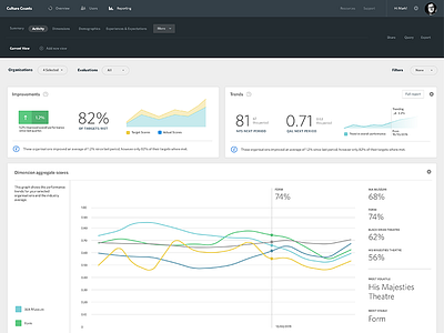
This is a bit of an experiment for our reporting analytics ui at Culture Counts. Aim of the game here is to make is to make the data attractive but also actually convey meaning with it. Too many dashboard visuals go nuts with the aesthetics, but completely disregard the actual design problem - providing the user with clear insights into the data.