Dog Walking App Case Study

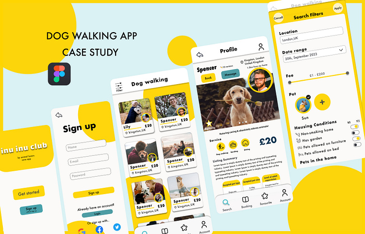
this inu inu club is a dog-walking app that seeks to concentrate on the dog as the main focus of the design, creating trust with the users by concentrating on the needs and well-being of their pet.
Design process
User Research
I asked my Japanese friends at Japan, and my neighbors at UK.
・Many people think that the most important thing for dog walkers and sitters is trustworthiness.The profile of sitters at PetBacker shows that ID Verified/Online Test/Passed Sitter Intro Test. It is a good idea The way users to judge whether sitters is a trustworthiness people or not.
・It is important to design for simplicity, as people of all ages, not just young people, will use this service app.
Market Research
Rover
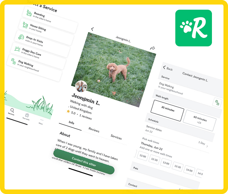
Features
・get adorable photo updates
・GPS tracking of your dog’s walk
・an easy way to message sitters or manage your services
・a secure way to book and pay.
PetBacker
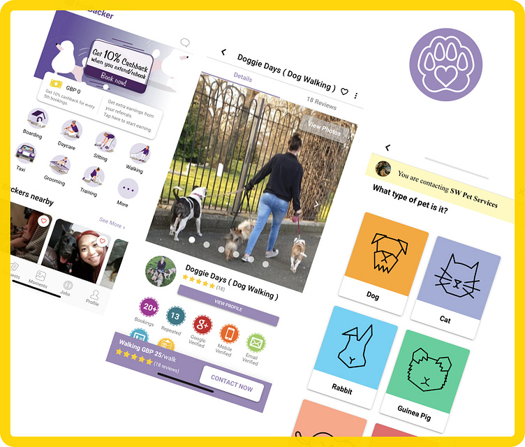
Features
・share and show off your dog & cat photos
・hire trusted Pet Sitter for boarding, minding, walking, grooming,spa and daycare.
The concept is simple, use PetBacker to get people to take care of your pet when you not available, or earn extra money with your love for animals.nter your text here...
- Missing opportunity
Rover
Hard to find a message tab for some people. The icons are also confusing. (PetBacker has fixed buttons for messages upright. It is easy to recognise because the icon is a speech balloon.
PetBacker
To see sitters or service users need to create an account first. It is not a good point if someone wants to look for service before creating an account.(Rover can look for service without creating an account.)
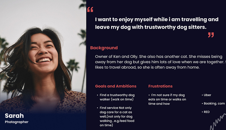
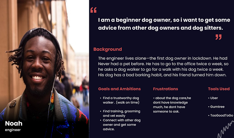
Persona
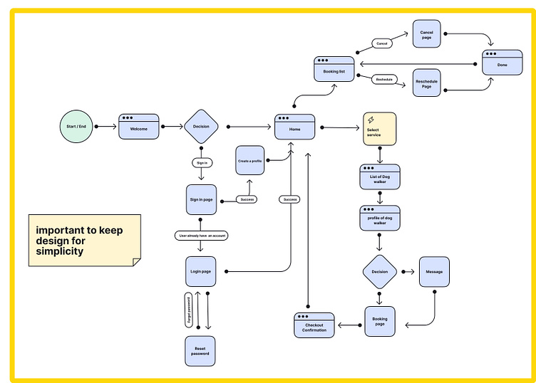
User flow
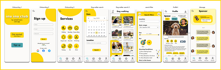
Wireframes
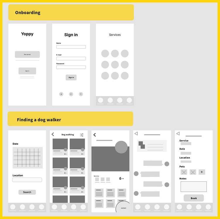
Enter youAt the onboarding, once a user gets the app soon, they can get started to see how the app is without sign-in.
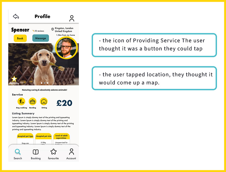
On the profile page, left at the bottom of the picture user can check if the dog walker has “ID CERTIFICATION” or “Training experience” badges.
And on the bottom bar, they can soon get to the message page or booking page.
On the message page, on the top, put a few pieces of information about the dog walker who messages with—no need to return to the profile page to see information again.r text here...
Visual Designs
Prototype + test
Scenario:
Who used to work from home, but from now on, has to go to the office three times a week and would like to find a dog walker with experience who can take for a walk while giving you constant updates.
Task:
Find a dog walker and book.
Success:
Get started→ select service→ search→ select dog walker→go to message or booking pagenter your text here...
Failure points

Key Improvement Points from the tasters
- The price was next to the Providing service icon, so they confused "boarding" and "Sitting" also £20. (Profile)
- The” message button” colour is a bit dark. a little bit lighter is more good. and if the "Book"/"message button" is under the picture, it is easier to tap (Profile)
- On the booking page, if the user selects more than one pet, they want to know the extra fee. (Booking page)
- On the filter page, no need to put the "pet" section. (Nothing affects to search a dog walker)
- Message page whether it is necessary to put info or not.

Outcome / Results
This CASE STUDY has been designed to have an overall bright image.I considered this so everyone can use it easily and simply.
I struggled a lot with the auto layout part because it didn't always work as I had imagined.
In the Prototype and test part, even though I thought I could make it, there were many stumbling blocks and I had to repeat the corrections and tests.
Overall it was challenging but fun. I want to continue to work hard and not give up! Thank you!