Income Graph Switcher

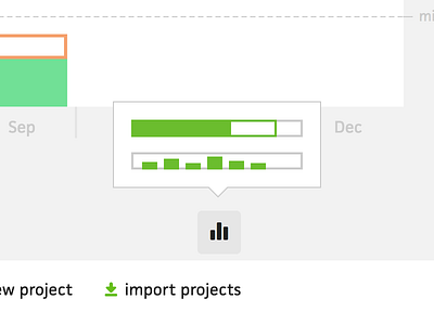

In building the income graph switcher for Cushion, I had a hard time finding the right words to clearly describe each graph. One graph displays income for the year in a single bar graph, filling up to a goal. Another graph displays income per month as a vertical bar graph, with many bars.
The first direction was to use “Horizontal”/“Vertical” to indicate the options. That wasn’t very clear and describes the graph more than the purpose or context. I could go the “Year”/“Month” route, but that’s not entirely clear and there might be other year or month-based graphs in the future.
As a more out-there direction, I'm trying a visual approach. Since the graphs are using the same data, people might be more familiar with their appearance than any word or phrase that could describe them. It makes sense to me, but I'm going to have the Cushion beta users try it out first to double-check.
(You should try Cushion)