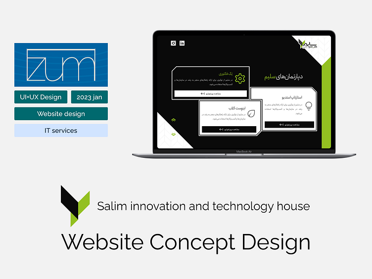
Salim inotech house Website Concept Design
Showcase Video
As i have designed this concept website with a “Parallax Effect scrolling”;
to better showcase i have uploaded a video of the first page to my youtube channel, you can visit it at the link below:
Link: https://youtu.be/ijF54YpZvbo
1.About the project
Salim is an IT company that provides design and development services to other companies; in my time working there i had the opportunity to work on several projects, one was this experimental concept design for the company itself.
There were Brand identity material and guideline already designed by a graphic team and company structure was established, marketing plans and social media presence was established and several projects were developed and some was on their way.
---to give this project a pizzazz i tried a parallax effect upon scroll technique that would make the website unique in the market; to make a remaining “awe” moment for the users i took a risk of having a rather radical intro page, this page is showing an old “static noise tv” with company logo, tagline and name in grayscale in the middle; as the company tagline is “ your partner in development” while the intro is fading and the home page is showing everything comes to life, hence the development tagline; with the brand materials the website gained a unique feel to it and it would be attending to business needs as well.
In this project i have incorporated “ Brand Identity material” including colors and shapes into the design; allocated section for marketing and social media plans and materials, assigned a section to address different departments of the company and projects in them, reserved a section to showcase our success stats and work partner companies and at last a place to inform users of our contact information, social media opportunities and a way to contact us.
Check out the showcase video at my youtube channelhttps://youtu.be/ijF54YpZvbo
Role
UI + UX Designer Responsible for
information architecture,
interface design and
prototyping
Client
Contractor: Salim innovation and technology house www.linkedin.com/company/salim-e-commerce-solutions
Date
2023 jan
Journey
in this sections i try to explain some of the design as it is in farsi and also static
Intro Page
a static noisy screen representing old tv and undeveloped technology with a Logo, a name and a tagline in grayscale; as the company tagline is “ your partner in development” while the intro is fading and the home page is showing everything comes to life, hence the development tagline
Home page
static is gone, the logo, name and tagline comes to life and move in screen . a background pattern, a video player embedded in logo, the header and a text block explaining what company does appears on the screen
Video of the workplace environment
upon click on the play button in home page, the shape expands as in you are entering the company workplace and a video plays automatically which then you can close
Podcasts and events
as you scroll down on the home page or use the arrows the logo expands and you move into it to see next pages of the website; this section is reserved for social media and promotion programs: first a horizontal carousel with arrows to navigate that would show a set of podcasts program episodes that company was sponsoring and secondly: a vertical automatics carrousel list of events that the company sponsored or was participating. both contents are clickable and would link to other sites and platforms
Departments and portfolio
as you scroll and move in the logo ( company) you reach this section that represents the company and departments: investing, designing and developing that each card represents one of these departments and upon click they would show a list of the projects done by the company in this department. a nice hovering effect was designed for each card to capture eye and attention
Stats and Partners
scroll down more and you move into the right wing of the logo where an automatic horizontal carousel is showing company's partners logos and names; also three stats about company startup projects, developed projects and business partners
Outro footer
at the end of the pages comes the footer which includes a contact company information card with a link to Instagram page and LinkedIn page and also a form for users to contact the team via message
4.Results
although this design has never reached a development phase due to tight schedule and budget , yet i have conducted several usability test and A/B test on them which has showed great promise and with a little polish, i believe it can become a real star. it has greatly tested and enhanced my artistic ability as well as design technique; it is a design which i cherish in my portfolio.
be sure to check the video showcase in my youtube channel as wellhttps://youtu.be/ijF54YpZvbo


