


Another Dashboard Redesign

I was sick of my dashboard looking like the swarm of them on the Play Store these days. It also looked like it came straight from Google, design-wise, with typography taking a huge hit.
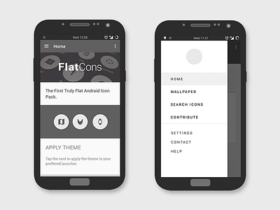
Hoping to stand out I made some major changes to the UI. The first shot looks familiar, yet more satisfying, with a generous distribution of white space.
Typography was my main focus with this redesign, noticeable in the drawer especially. I replaced the hero image with a simple drawable xml that represents the icon pack. This looks cleaner and essentially cuts the size of the app a little, which is always awesome.
Thanks for taking a look and stay tuned for more shots!
Hit L if you like what you see!