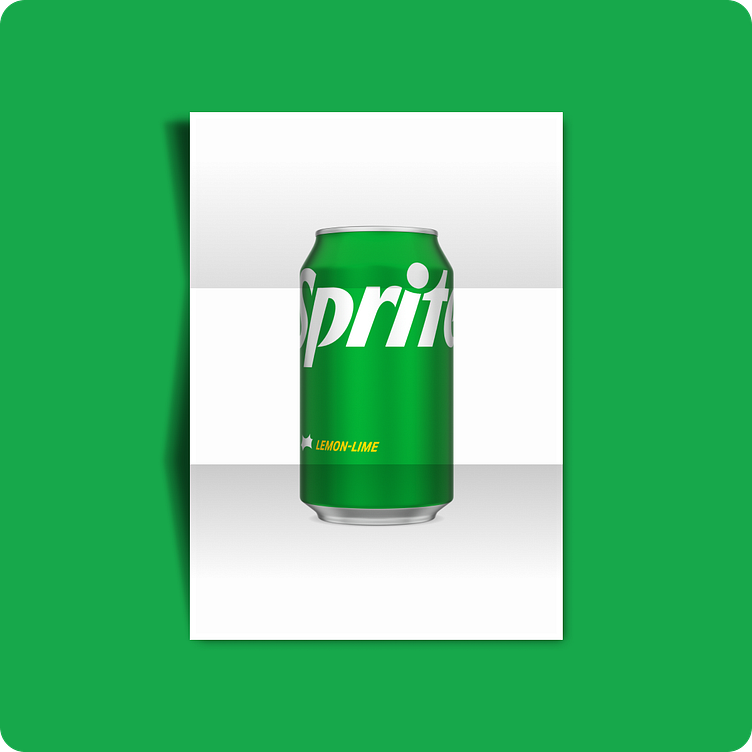
Reviving the Essence: A Vintage-Modern Fusion for Sprite Logo

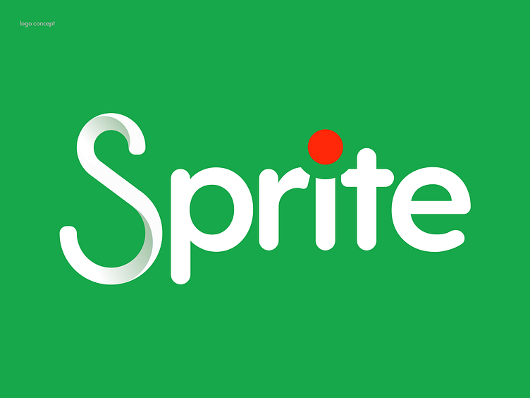
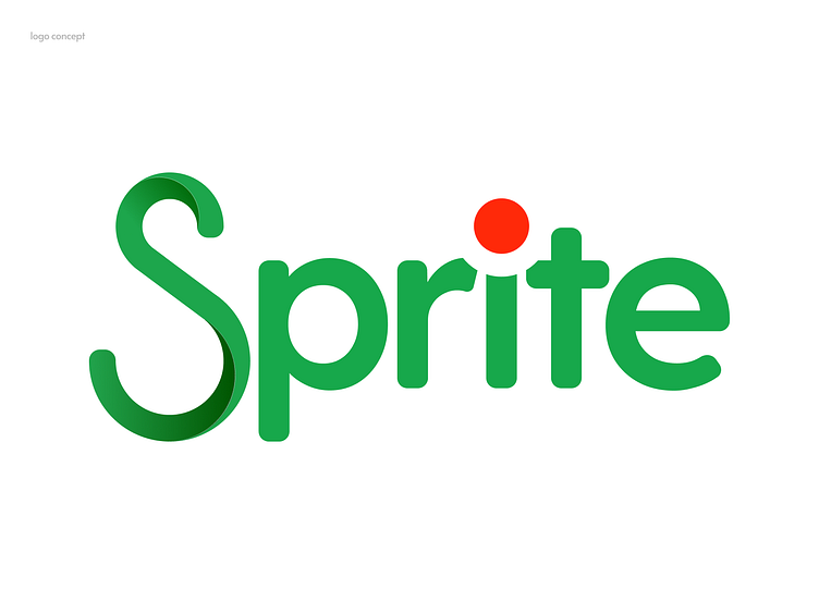
🎨 The Challenge: While strolling down the street, I spotted someone sporting a vintage Sprite logo (from 1974), and it immediately piqued my interest. It left me pondering, "Why is the current logo so lacking in presentation?" The answer lay in the captivating orange dot from the vintage version.
💡 My Creative Approach: Inspired by the allure of that iconic orange dot, I set out to infuse it with a modern touch. Incorporating the contemporary 'S' style letter, I aimed to create a logo that seamlessly melds the best of both worlds—vintage charm and modern aesthetics.


✨ Balancing Symmetry: In the world of modern logo design, symmetry plays a pivotal role. This project showcases how the pursuit of balance can transform a logo and make it stand out.
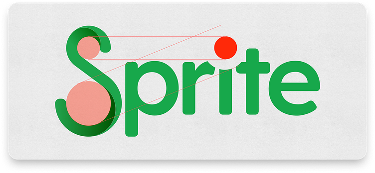
🌟 The Result: The revamped Sprite logo bridges the gap between eras, preserving the essence of the vintage design while introducing the precision of modern symmetry. It's a harmonious blend that captures attention and pays homage to the brand's heritage.