Google Maps - App icon redesign concept #17

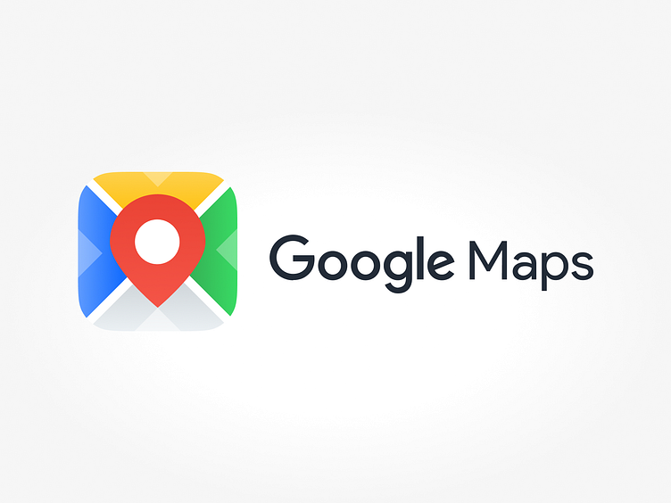
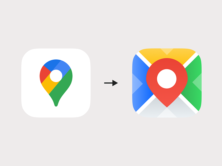
My Google Maps app icon redesign concept.
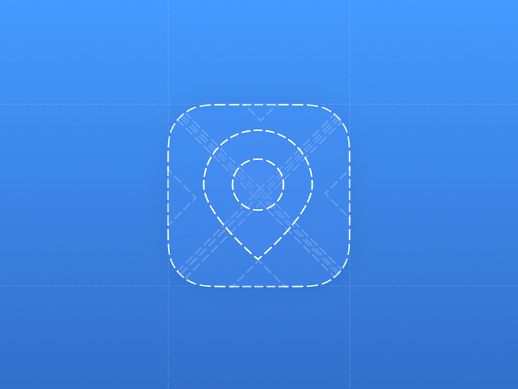
This time, I've infused the design with a captivating twist by incorporating colorful squares with a central pin element.
This concept breathes new life into the iconic Google Maps logo while maintaining its core functionality and geographic essence. The addition of vibrant squares adds a modern and dynamic touch, symbolizing the diversity and richness of locations found on the platform.
Dive into this creative journey that harmoniously combines innovation with recognition, offering a fresh perspective on the Google Maps icon. Explore this concept that envisions a Google Maps icon that not only guides your way but also celebrates the world's colorful tapestry through its design, making it a visually engaging and relevant emblem of navigation and exploration.