


Income by Month

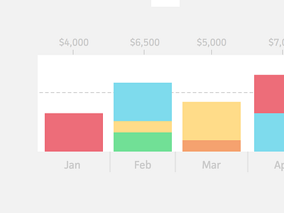

Since its debut, Cushion has only had one type of graph for the income view. As you add invoices, a bar graph fills up with your financial goal being the far edge. This is great for seeing your standing for the year, but what about each month? Are you on pace month-to-month or are you coming off a slow month and need to catch up?
I've had this idea in my head for a while now and finally sat down to visualize it beyond a sketch on a sticky note. It looks and feels right at home with Cushion's interface and brings a whole new value to the app. Actually building it is another story, but a manageable one for sure. I'm just not sure if this is a priority right now or if it can wait while I tackle a few more-pressing features.
(You should try Cushion)