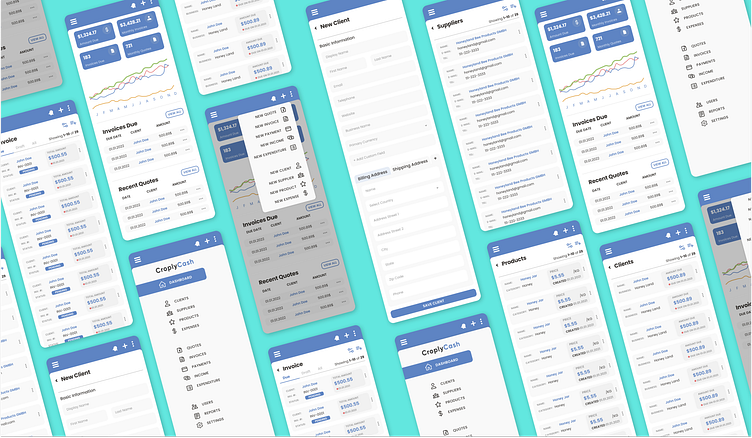
CroplyCash Mobile & Web Dashboard

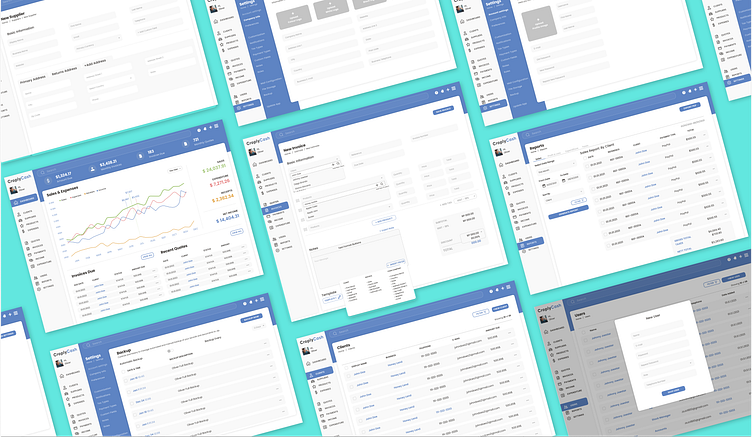
Designing both the web and mobile dashboards for the Croply Cash invoicing app, totaling over 200 screens, was an immersive and transformative experience that significantly advanced my skills in UI/UX design. The sheer scale of the project challenged me to think critically about information architecture, user flows, and consistency across platforms. I learned the importance of maintaining a cohesive user experience while adapting to varying screen sizes and interactions. This project honed my skills in wireframing, prototyping, and user testing, as I had to meticulously plan and validate each screen's design to ensure usability and efficiency.
The project also taught me the art of simplification. With a multitude of features and data to present, I discovered the power of minimalism in design, striving to create clean, intuitive interfaces that farmers using Croply Cash would find approachable and user-friendly. Moreover, this extensive project instilled in me a sense of discipline and organization, emphasizing the significance of design systems and documentation to maintain consistency throughout the project. Overall, designing for Croply Cash was a pivotal learning experience, shaping me into a more proficient UI/UX designer with a heightened appreciation for user-centricity, adaptability, and the art of simplifying complexity.