Welcome to the Case Study on the dog-walking app- Zampa!

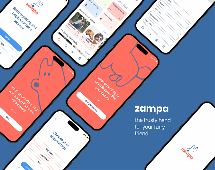
The illustrations for the app design are created by me personally.
Welcome to my Case Study on the dog-walking app- Zampa!
Hello, I'm Svetlana! With a background in technical recruitment and a fresh perspective in UX/UI design, I'm driven by the desire to craft visually captivating and user-centric designs that tackle real-world challenges. My unique blend of experience, including understanding people, psychology, and bridging technology with human needs, empowers me to bring my designs closer to the user.
How did the story begin?
With a deep love for animals, I embarked on the journey of designing a dog-walking app as part of the Dribbble Design Academy. My goal was to enhance the experience for dog owners in finding reliable dog walkers and dog caregivers.
Brief
In today's fast-paced world, dog owners often require assistance in caring for their beloved furry companions, whether it's for daycare or a simple walk. However, the question remains: how can one effortlessly find the perfect individual for this task?
So, the brief given within the Product Design Academy was to create a service to connect dog owners with dog walkers.
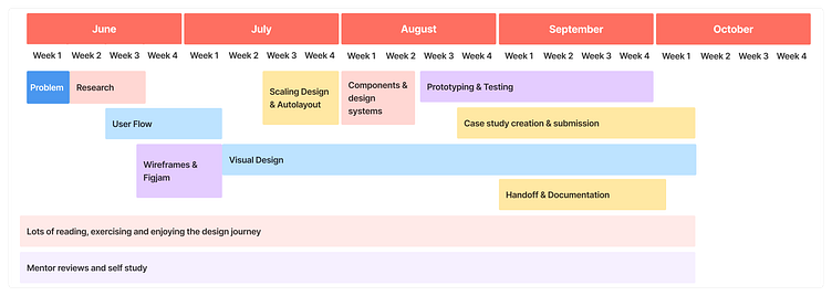
Before we dive into each step of the process, here is the summary of the timeline that will take you through the path I took for designing the dog-walking app:
Problem: how can I trust my beloved pet to a complete stranger?
This was the challenge our project set out to conquer. Our primary objective was to develop a user-friendly application that seamlessly connects dog owners with highly skilled and reliable dog walkers and sitters.
User Research
To better understand user needs and pain points, I conducted research interviews with dog owners spanning different locations (Italy, Armenia, UK). These interviews provided valuable insights that helped me empathize with users during service development.
Key takeaways and solutions provided by Zampa:
Dog owners prioritize trust in their dog's caregivers, necessitating prior dog care experience > I've introduced required fields in the Dog walker profile to highlight experience and dog ownership
Most dog owners want to meet potential walkers in person to see how their pet reacts >I've made it simple to set up a meeting before booking
Transportation challenges, including pet restrictions and fees, are common issues > dog walkers can now offer "available with a car" as an additional service for convenient filtering during searches
Finding pet-friendly venues can be a struggle > the app aggregates nearby pet-friendly spots for their enjoyment
With many stray dogs around, they keep a close eye on their pet to avoid potential dangers > dog owners can now specify their pet's special care requirements in their profile section, ensuring that the chosen dog walker possesses the necessary skills to meet those needs
Grooming and vet service discovery challenges have been addressed with the inclusion of relevant information
For trips to the vet, dog owners can easily locate car-equipped dog walkers through filters.
Market Research
I’ve researched the below three apps by actually downloading them and trying the services. I went through the testimonials in the app stores and conducted a SWOT analysis. Below you can see a SWOT brief:
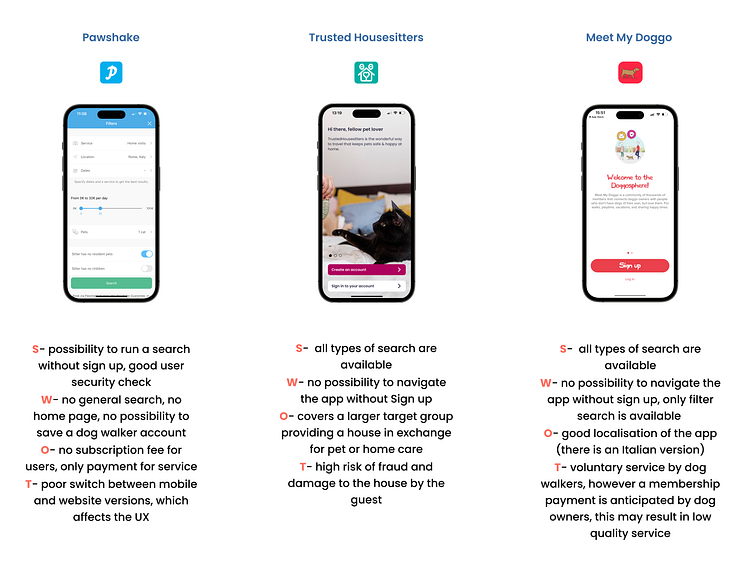
After researching these apps, I have identified a set of essential features and outcomes that my app should aim to achieve:
Implement a clear and user-friendly onboarding and registration process
Provide a general search bar, filters, and map search
Offer user activity status, availability calendars, and easy contact options
Create comprehensive profiles for both pet owners and service providers.
Ensure profile verification with predefined criteria
Ensure accessible online support, and responsive feedback mechanisms, and explore monetization opportunities like pet insurance.
These outcomes aim to enhance user experience making it more accessible to a wider user range, improve trust and safety within my app
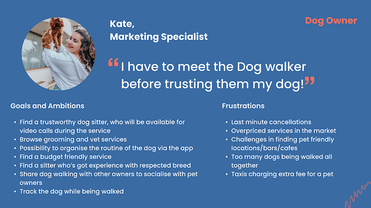
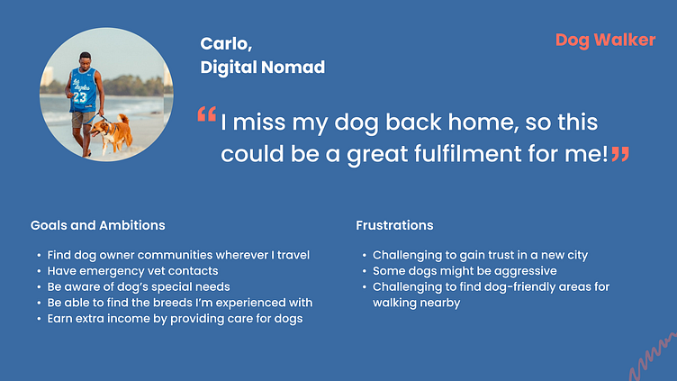
User Persona
From here, I was able to understand my potential users’ needs and preferences, allowing me to create a detailed representation of a typical user. I created 2 user personas: the dog owner and the dog walker, who then my design decisions to ensure the product meets their specific needs.
Here are some key insights from my user personas:
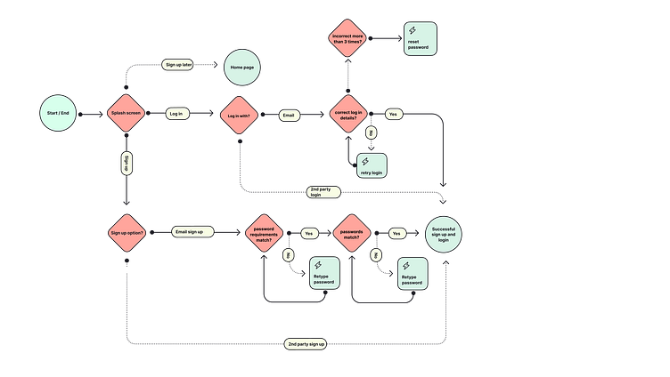
User Flow
During my market research, I observed that many apps require users to sign up before accessing content, potentially discouraging engagement and leading to high abandonment rates*.
To address this concern, I suggest a user-friendly approach for our app. Users should have the flexibility to explore our services without any initial commitment, with access to minimal information on user personal details. Registration or login requests would only occur when users wish to take specific actions, such as contacting someone.
This was the starting point for crafting my initial user flow, with the goal of improving user satisfaction and retention.
*High Abandonment Rates: Requiring users to sign in or register before they can access any content or functionality can lead to high abandonment rates. Some studies and industry benchmarks suggest that apps can see abandonment rates ranging from 20% to 60% or even higher when a sign-in is mandated upfront.
Wireframing
I started by identifying the essential features required for the application. To define these features, I referred to the user stories I had developed during our bootcamp home assignment. Next, I moved on to the wireframing stage, which was a pivotal part of the process. This step helped me determine how to arrange the elements visually. It involved a bit of trial and error, but it was a valuable learning experience.
Ultimately, I progressed from initial sketches to creating digital wireframes, which served as the foundation for my design work.
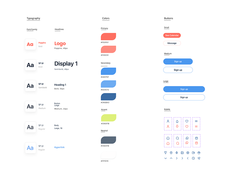
Design System
In the design of the dog walking app, I've placed a strong emphasis on capturing the lively nature of dogs. This is achieved through the integration of eye-catching, playful, and seamless colors. By combining these elements, I've created an intuitive interface that ensures the app is both enjoyable and user-friendly.
Prototyping
Oh, Prototyping!! This was an enjoyable and enlightening experience for me. It was the perfect moment to witness my designs coming to life, and it allowed me to discern what was effective and where improvements or redesigns were needed
Testing
After conducting the user testing, I identified several obstacles that would affect the the quality of the user friendliness of my app. Below the tested (Before) and improved( After) versions of the app design are presented. The user testing after the changes came out to be more successful.
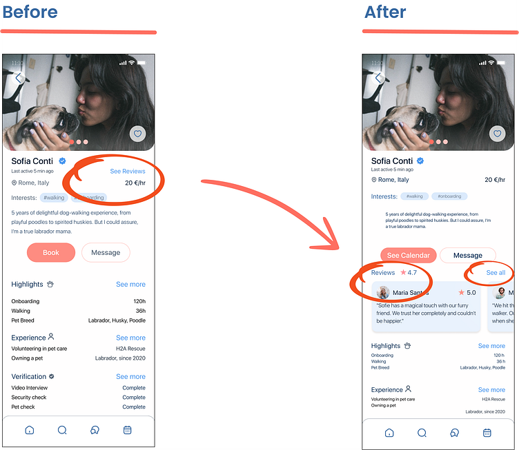
Case 1. The user got confused when they couldn't locate the “See reviews” right away and had trouble identifying the clickable "See Reviews" text. Accordingly, I brought forward the reviews making them more visible and easy to navigation
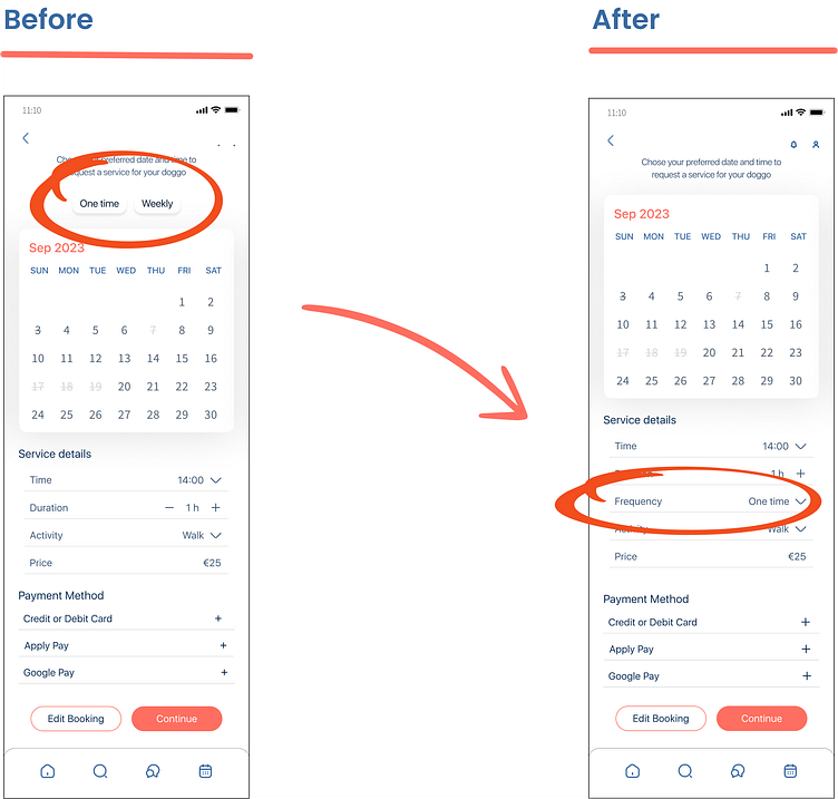
Case 2. The user failed to notice the frequency buttons while creating the booking request on the calendar, I noticed the user was looking for it in the Service details section. Making this change I eliminated additional actions and confusion.
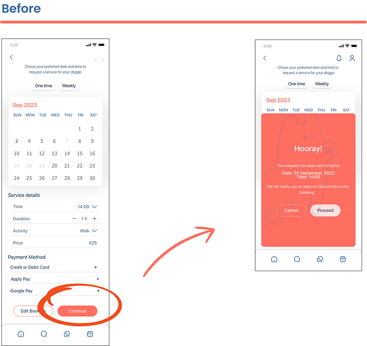
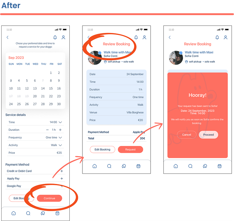
Case 3. The user was expecting to see a booking review with all the details before sending the booking request, which I missed when designing the booking request function. Accordingly, I added an additional step.
Learnings
The journey has been a continuous learning for me, let me share some of the key ones:
User research isn't just important, it's like having a trusted guide at hand at every turn of the app design journey
When it came to designing the app, it was like solving a puzzle with many pieces, and there was no one-size-fits-all approach. It's a dynamic, cross-functional process that requires staying connected to all the elements of the app
I was looking to achieve simplicity, it seemed easy in the beginning, but it's actually quite a journey, which demands a solid grasp of design principles and consistent practice until it becomes second nature
Whenever you find yourself stuck, just dive into testing things out – clarity often emerges along the way
Choosing the right color scheme to convey my message felt crucial, even if it meant a bit of trial and error
I learned that it’s way more beneficial to start building a design system and applying it from the initial stages of the design
Prototyping directly on the actual device was a vital part of the design creation process, which brought me closer to the user, just from where we started.