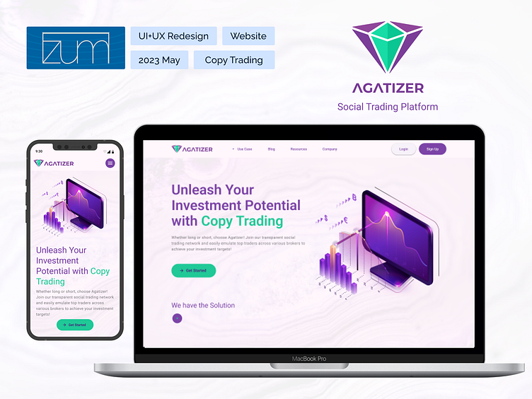
Agatizer, Social Trading Platform website
1.About the project
Agatizer, with a former website design, was in need of a new design that could be developed fast and be minimal and easy on the eye.
The outcome of the redesign was a minimalist landing page related to brand’s identity, some new pages and sections newly added and a reconsideration in information architecture.
Role
UI + UX Designer responsible for website
UI redesign,
information architecture and
user journey reconsideration and new pages and sections
Client
Mohammad Aghighwww.linkedin.com/in/aghighnet/
Date
2023 May 1 week
2.Challenges
Former designs of the landing page have used visual elements that disregarded technical limitations in development, not accessible at some points and were also non-relevant to brand’s identity.
Technical team had challenges developing a responsive design on desktop due to lack of standard grid use and this problem was spread to mobile view as well.
The business team was not feeling connected to the general design and a lack of brand’s identity was tiresome , they needed some new sections added to the website and the secondary pages did not have any design to them.
Information architecture had some issues to it and could not address business new needs.
Some exclusive icons were designed for the brand that did not have standards needed for dev team to use them properly.
Former designs were not conducted in a web standard grid and accessibility issues were raised.
3.Process and Solution
Firstly, I analyzed the current structure of the interface while studying some competitors in the same field to get a general sense. After a meeting with the project owner, I got a sense of their situation, I learned more about their brand identity so i could implement that in design; some pieces of information about their naming being related to owner’s name being “Agate” which is the banded volcanic and metamorphic rocks. Also I have learned that they want to create a platform leaning toward social media and that the users were to have a sense of being part of a “tribe”.
Information architecture issues were raised, in former design the business had two main customers: Investor and trader but now partners were added so a drop down menu was added that could contain all three of them and was named use cases.
Also the owner had plans to connect a blog to website so that was added as well After the initial meeting, I showed the former website to some colleagues, and users of overall 6 people to get a grip of the sections in need of change.
Sketches and wireframes of the new Homepage were drawn, as well as new pages that needed to be added to the website. And a new information architecture model was drawn to be considered.
After a second meeting with the owner I got approval on the overall wireframes and got to design the faze.
I used the google material 3 design system to set up color, typography, style and some other things such as buttons.
A flex and bootstrap grid system were set up to support responsive design.
A mood board was gathered to guide me throughout design
Exclusive icons were redesigned in adobe illustrator with the proper settings.
Some pictures related to Brand’s identity and industry were gathered to be used.
Copy writings were rewritten to maximise influence.
Brand Logo was readjusted to be used in horizontal layout.
4.Results
After the first batch of designs, meetings were conducted so the owner could put out feedback and some changes were made and the final result was to their liking.
The project is now live but due the business funding problems some development has been delayed and some pages are not developed yet, also some details were missed by the the tech team that were noted and relayed to project owner so that they could be corrected
You can visit the platform at https://agatizer.com/
Respectfully the panel redesign was a project of Izumi as well; development is under surveillance of Agatizer Business Team.


