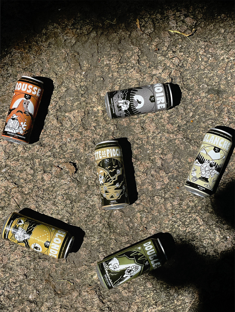
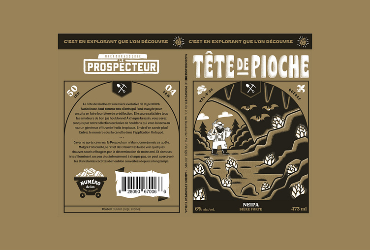
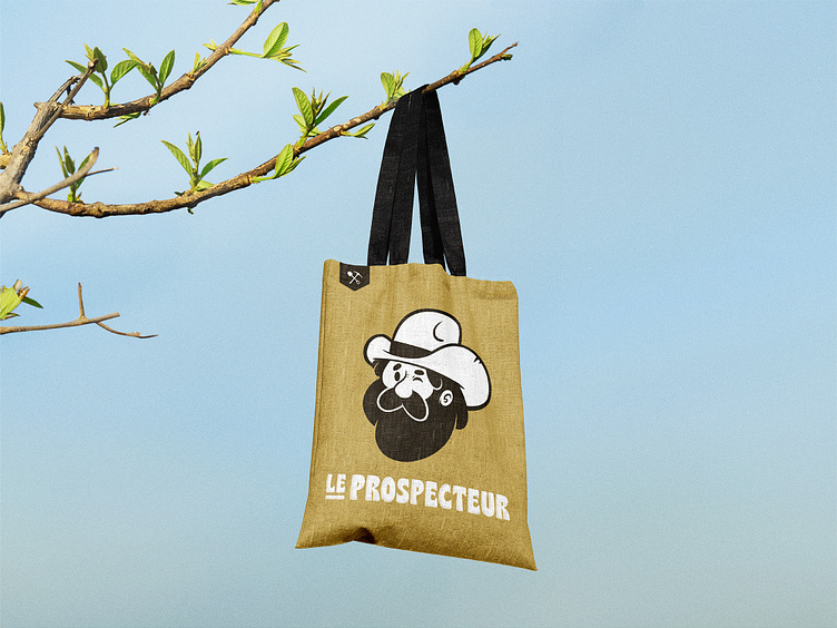
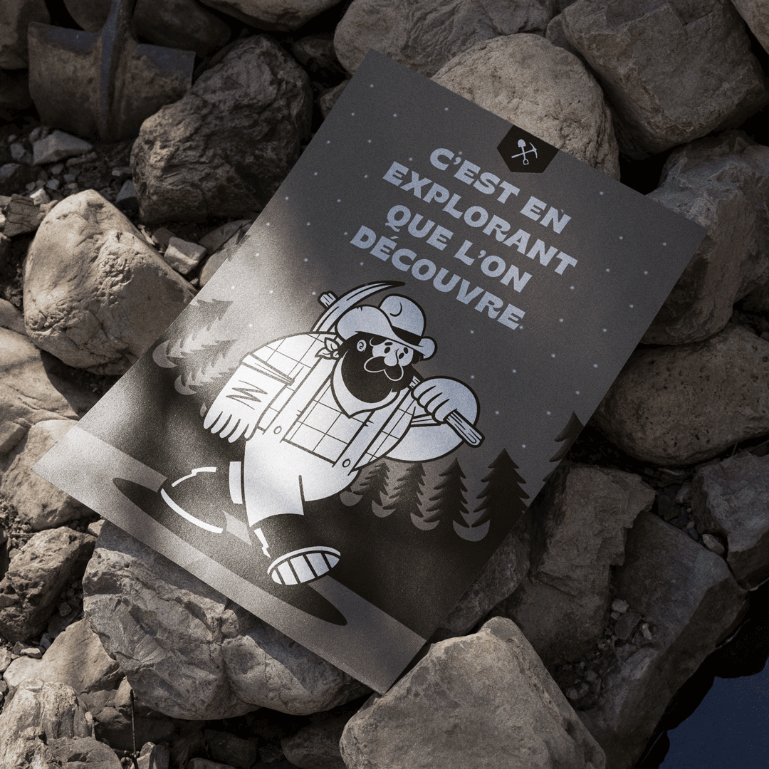
Le Prospecteur - Beer Can Label Design

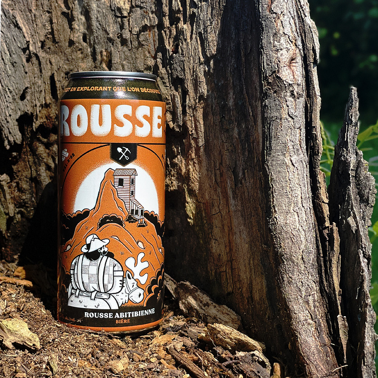
Le Prospecteur wanted to stand out from the competition, solidify their brand image and rethink their marketing strategy, so we came up with a new marketing strategy and a brand new graphic territory in line with the microbrewery’s DNA, with the goal of having their hoppy golden nugget travel across the province.


An epic journey
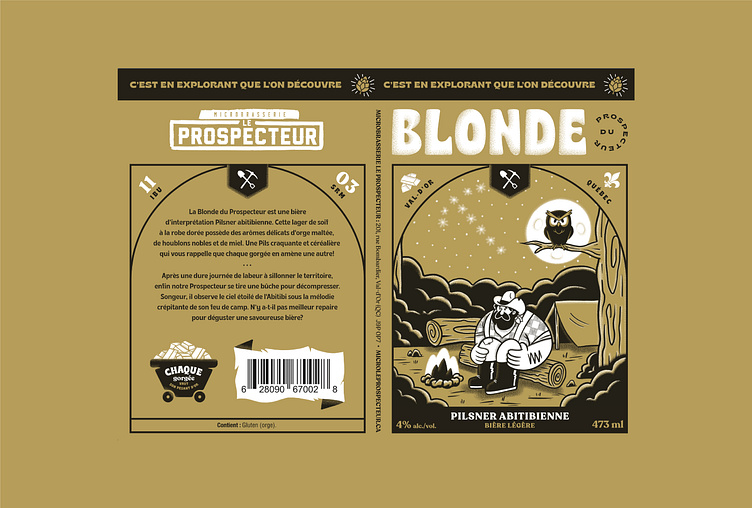
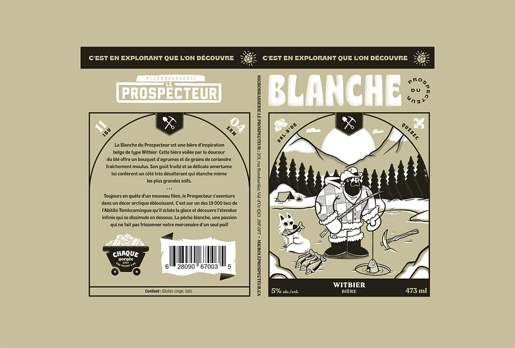
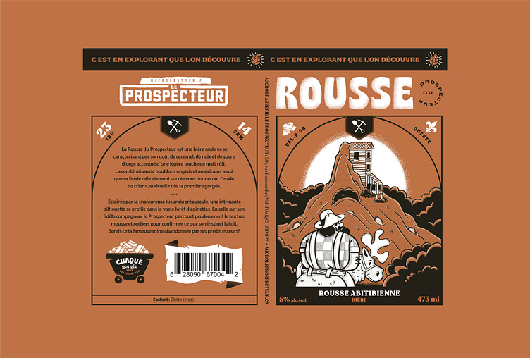
To truly stand out, we wanted to draw attention to a strong, well-known symbol in the consumer’s imagination: the prospector. In doing so, we not only clearly identified the brand, the products and the history, but also paid tribute to the microbrewery’s hometown, Val-d’Or.
"Exploring is discovering.” This tagline became the anchor point around which we developed a bright and promising graphic universe and a strategic positioning within a bustling industry.