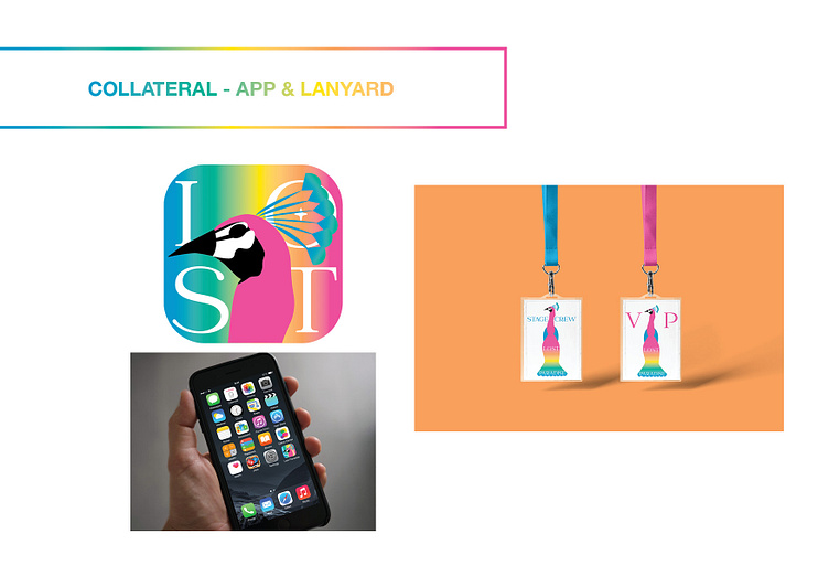
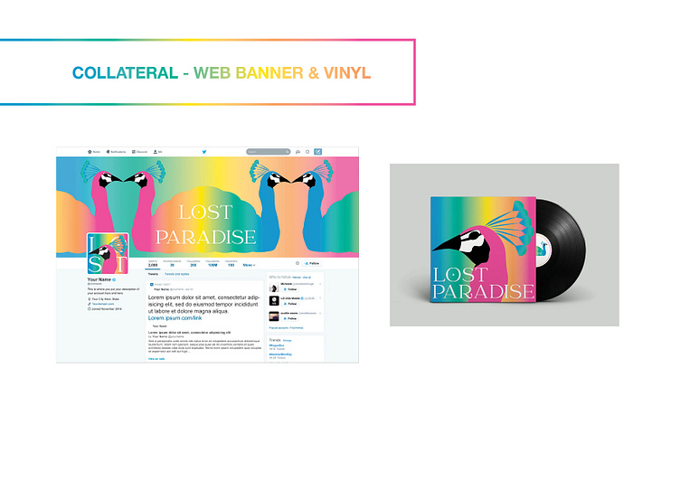
Lost Paradise Festival Rebrand and collateral


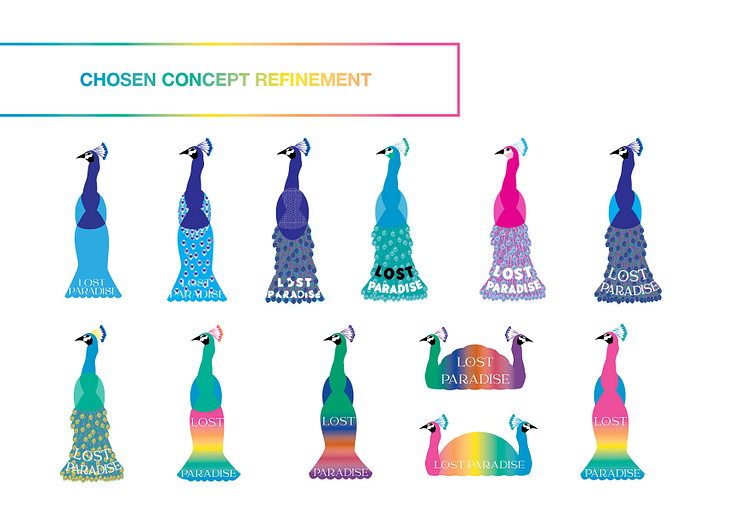
For this fun task, I was required to research and design the brand identity including the new look and feel as well as logo in multiple formats that would differentiate Lost Paradise from other events as well as reflect their vibe. As they encourage dress ups and get some pretty out there costumes, I decided to follow down the path of the peacock.
The peacock is also symbolic in a number of ways; peacocks are considered exotic animals representing the festival as an “escape from reality”, peacocks symbolise spirituality, freedom, self-expression and love which fits with the festival experience where patrons are encouraged to treat everyone with kindness and express themselves through fancy dress, lastly peacocks are known as harbingers of rain (they dance with joy when they know it’s about to rain), supporting the festival dance party vibe.
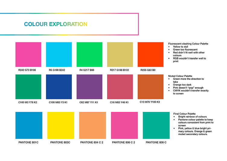
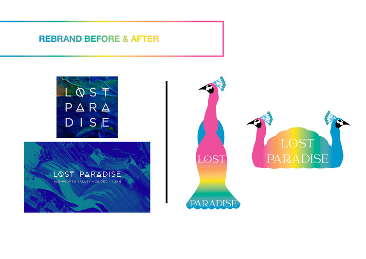
After many refinements and consultation, I landed on this simplified version of a peacock with a rainbow tail in a colour blend that was both tranquil and energetic, like the festival. The choice to use a rainbow of five colours denotes the festival brand’s alignment and acceptance with the LGBTQ community as the brand is welcoming of patrons from all communities and the rainbow has been identified with gay pride since the 70’s. The colours represented in the logo are representative of the following aspects of the festival: Pink represents and openness about displaying sexuality; orange represents healing mind and body experiences such as yoga which is a daily event at the festival; yellow is the sunny valley of Glenworth valley; green represents the green valley that surrounds the patrons; and blue is the harmony created by dance, song and relaxation.
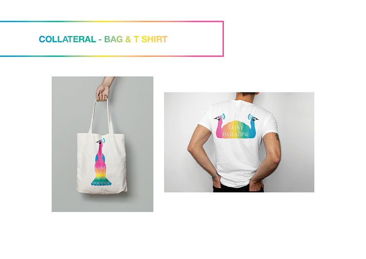
See below for my process and the final result.