UX / UI - SNCF redesign case study (Work in progress)

Some context
3756,47€. This is the amount I spend in train tickets in one year.
It makes about 60 bookings. And 60 times, I've made the same mistake when choosing my destination with the SNCF app.
Instead of adding the departure first, the app wants me to add the destination. But each time, I add the departure first.
My mom ? Same mistake.
My 3 sisters and 2 brothers ? Same mistake.
My best friend ? Same mistake.
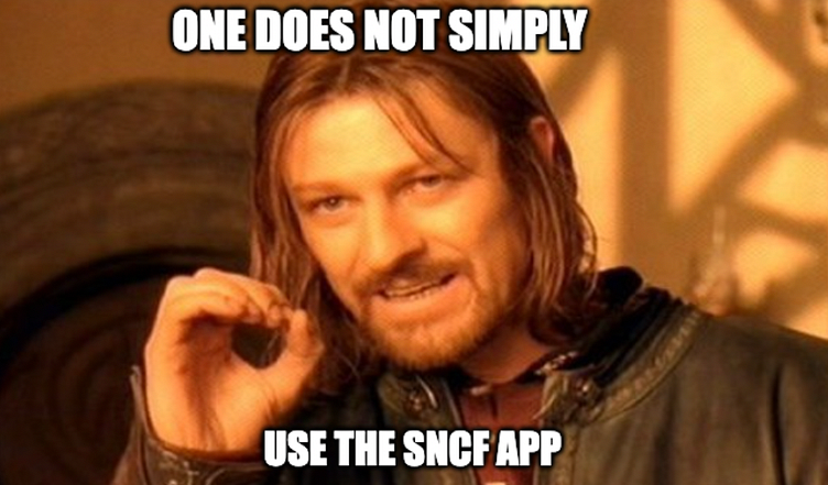
I also checked the ratings on the app stores to see if I was not the only one thinking that the app could be improved. And no, I was not the only one.
That's why I decided to start a redesign project for the SNCF app.
(SNCF stands for "Société nationale des chemins de fer" (National Society of the French Railways) )
Before to start the project, I need to learn more about the project scope. It is a list of questions to better understand the project.
Why a redesign ?
What are the risk if we don't do anything ?
What do we want to achieve as a company ?
Why a redesign ?
Based on passengers' (and relatives') reviews, the app is not intuitive and need some improvements (design and usability) ;
The app is not ready for the opening up to competition ;
Clients want to take train to be aligned with their ecological convictions but SNCF don't help them ;
To improve customer satisfaction in order to change the customer's perception of the brand.
What are the risks if we don't do anything ?
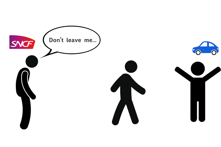
When the market will open up to competition, SNCF won't be able to compete against competitors which have a better app.
"The app is so complicated that I prefer to use my car." : SNCF will loose more and more passengers to the benefit of other means of transportation like cars, bus or planes.
SNCF brand image will be so bad compared to other apps that users will prefer to book their tickets somewhere else like Trainline or Omio which provide a better booking experience.
SNCF loose more and more business clients (who are the most profitable) to the benefits of plane.
What do we want to achieve as a company ?
For the product vision, I love to do some ideation exercices :
To sum up the ideal version of the product using this sentence:
We want to provide a [certain experience] to a [certain user].
"We want to provide a clear, smooth and fast booking process so that our regular and new passengers can book their train as fast as possible."
To create the best slogan like for an advertising.
Book your ticket in 1 minutes.
Tap a button. Get a train.
Open the app. Choose your destination. Book a train. Enjoy.
Basic research
Before to start my design, I made some basic research :
I did a competitive analysis of 2 other apps (Trainline & SBB). I compared their booking process with the one from the SNCF app.
I gathered data from the different reviews of customers on the different app stores (App Store & Google Play).
Afterwards, I put together similar patterns and add a label for each groups.
(Below, some of the groups)
I - Redesign of the home page
I started by redesigning the "home page" which is in my opinion one of the most critical page of the app.
When redesigning, I focused on the following elements from my research :
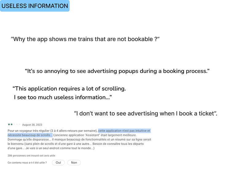
“Please delete the useless pages in the booking process."
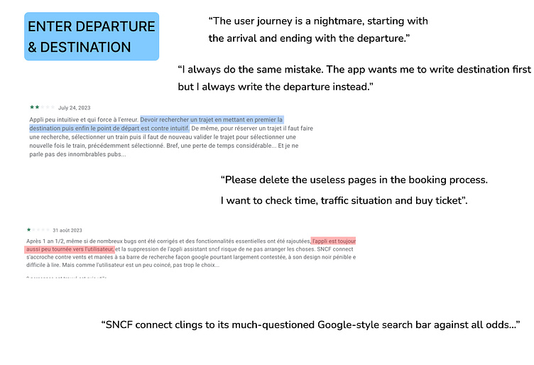
"The user journey is a nightmare, starting with the arrival and ending with the departure."
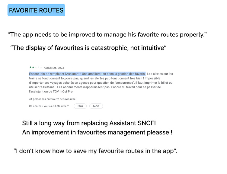
User needs to access "Favorite routes" and "Train station timetables" quickly and easily
A - “Please delete the useless pages in the booking process."
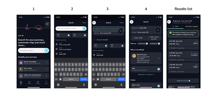
The problem: The user needs to go through 4 screens until he can see the results list.
My solution: These 4 screens can be combined into 1 in order to make the booking process much faster. It is also what all competitors I've analyzed do.
B - "The user journey is a nightmare, starting with the arrival and ending with the departure."
The problem: The way the app presents the "departure" and "destination" fields doesn't correspond to the user's mental model : the user expects to enter the departure location first and the destination after. The probability to do an error is very high (100% in my case :D).
The solution: Display the "departure" field first and the "destination" field second.
C - "User needs to access Favorite routes & Train station timetables quickly and easily"
"Favorite routes" and "train station timetables" are important features. In the former app "Assistant SNCF", these were some of the most used features by the user.
These features need to be visible and easily accessible on the page.
Solution: Emphasize these 2 features with the right contrast, colors and affordance/signifier.
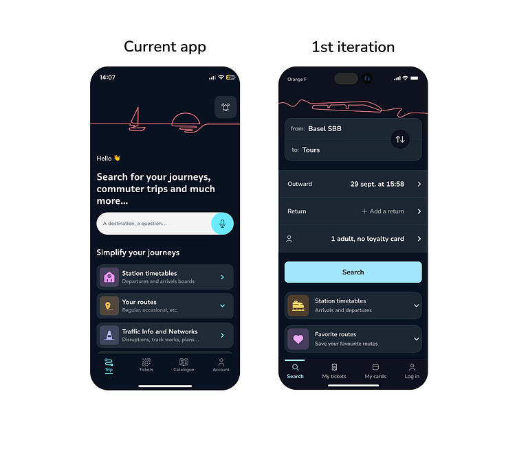
Implementation of the solution - 1st design iteration
To test if my iteration is better than the current design, I did a "preference test" on usabilityhub.
Brace yourself, results are coming.