Spotify Redesign


Case study on spotify
1. Introduction: Spotify is a widely popular music streaming platform, but it's important to continually evolve and enhance its app to meet changing user expectations and design trends.
2. Research: -Competitive Analysis: Analyzed other music streaming apps and entertainment platforms to identify successful design patterns and potential areas for improvement.
3. Goals:
-Enhanced User Experience: Create a smoother, more intuitive navigation and interaction flow.
-Improved Visual Appeal: Update the UI design to align with modern design trends and reflect Spotify's brand identity.
-Personalization: Introduce features that enhance music recommendations based on user preferences.
Simplified Navigation:
Streamline menu options and improve access to key features.
4. Design Process:
-Information Architecture: Simplified the navigation structure by categorizing content into four main sections: Home, Search, Library, and Profile. Utilized card-based design for improved visual hierarchy and content organization.
Created low-fidelity wireframes to visualize the new layout and interactions. Focused on improving discoverability, playlist management, and search functionalities.
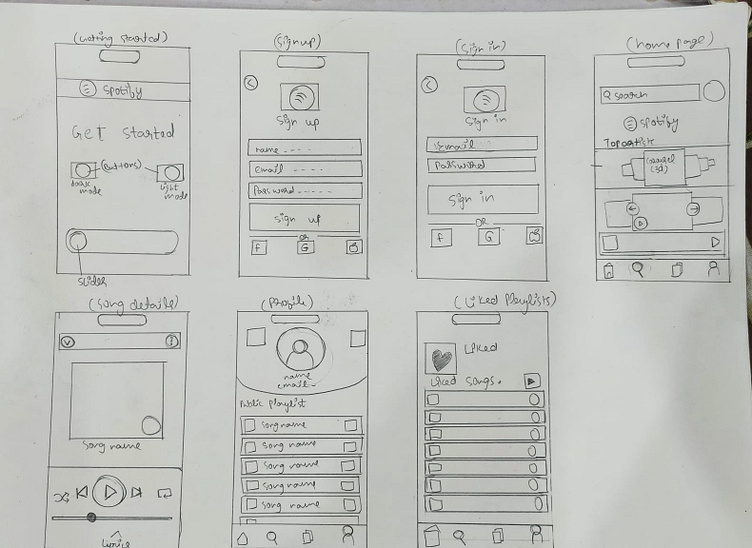
-Home Screen: top artists and their most popular songs and all of my playlist on the homepage.
-Search: Refined search functionality with an intelligent auto-suggest feature which have already famous generes of songs.
-Library: Divided user content into "Liked Songs," "Playlists," and "Albums" tabs for easier content management.
-Profile: Reimagined the user profile page with a focus on personalization and customization with an added feature of public playlist.
navigation bar: it consist of a bluetooth button which discovers nearby bluetooth devices which can lead to a good experience since the user will have an easy time connecting to devices, a liked section which will consist of all the playlist, artists , and your liked songs , a home button and a profile button.
5. UI Redesign:
-Color Palette: Retained Spotify's signature green while introducing a modern and subtle gradient effect for depth and vibrancy.
-Typography: Utilized a readable and elegant typeface called "pp object sans" for improved legibility and aesthetics.
-Iconography: Refreshed icons to create a consistent visual language that's intuitive for users.
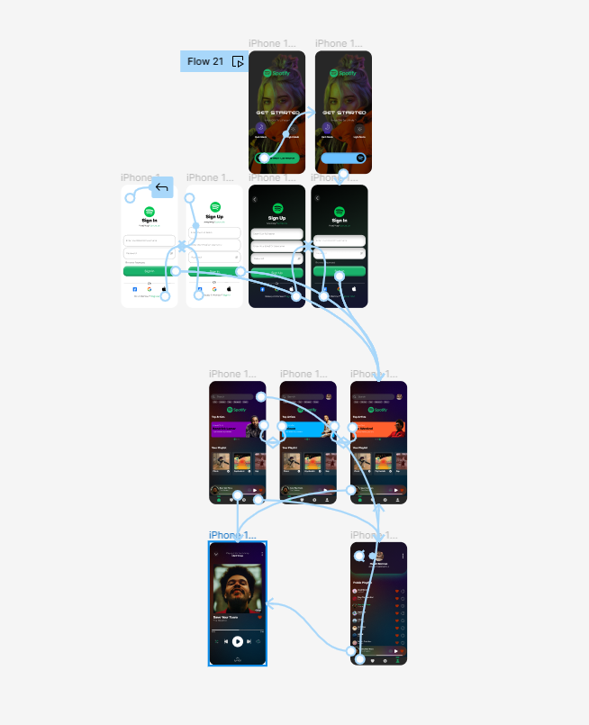
6. Prototype and Testing:
Developed interactive prototypes using tools like Figma to simulate the redesigned app's functionality and navigation.
Conducted usability testing with a diverse group of users to identify any pain points or confusion in the redesigned flow.
7. Iteration and Final Design:
changed the design a few times from the wireframe refined certain interactions, adjusted color contrasts, and improved the discoverability of certain features.
Created the final high-fidelity design.
8. Conclusion:
The Spotify redesign app aims to offer an enhanced music streaming experience by improving UX, introducing personalization features, and modernizing the UI design. Through a user-centered approach, the redesign aligns with Spotify's mission to provide users with the best music discovery and listening experience possible. The iterative process, incorporating user feedback, ensures that the final product caters to user needs while staying true to Spotify's brand identity.