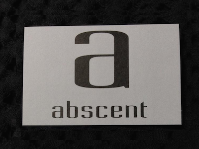
A logo for abscent

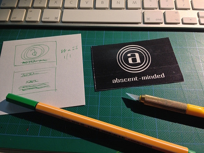
From doodled concept to proof. A logo. Going with a reversed out theme and some subtle aesthetics: the circles have deliberate tension and evoke the sensation that something is being minimized.
The proof was made on cardboard and trimmed to size. Whilst working in digital is fine, there is something about making a physical proof; holding it in your hand; seeing how is looks and works in the real world.