Wind turbines dashboard concept

Hi everyone!
This is a UI/UX dashboard concept for a fictional wind farm company, AquaWind, a company that operates floating wind turbines in the North Atlantic. I wanted to display their data in a user-friendly, aesthetic and intuitive way. I have designed multiple screens: Farm overview, Turbines overview, information on specific turbine, farm map and list of reports. I have used some dummy data, but I tried to make the data make some sense. I did some research about this topic and I have learned a lot! I hope you like it and feel free to share your feedback.
This project exists also as an interactive (clickable) prototype in Figma. It has more features not shown here.
If you want to know more, please contact me:
LinkedIn: LinkedIn
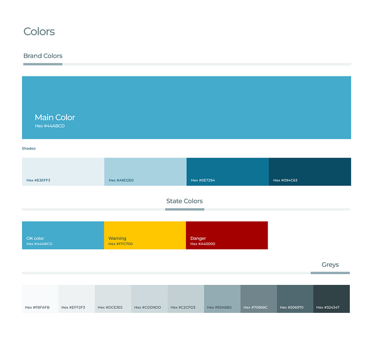
Colors
I have used a blue color palette to match the theme of the sea and the wind. I have also used blue, yellow, and red colors to show the status of the wind farm and the turbines. I have used gray colors to create a neutral and balanced look.
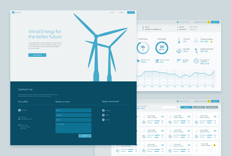
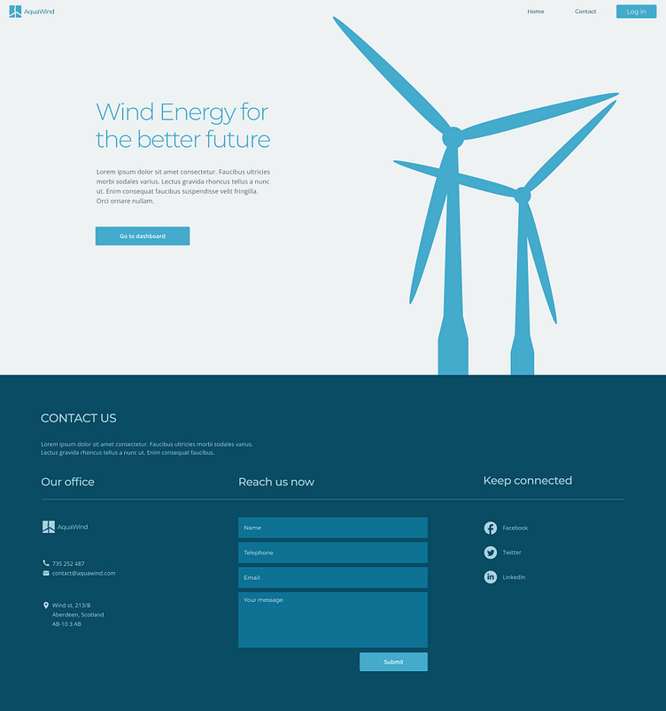
Home screen
This is the home screen.
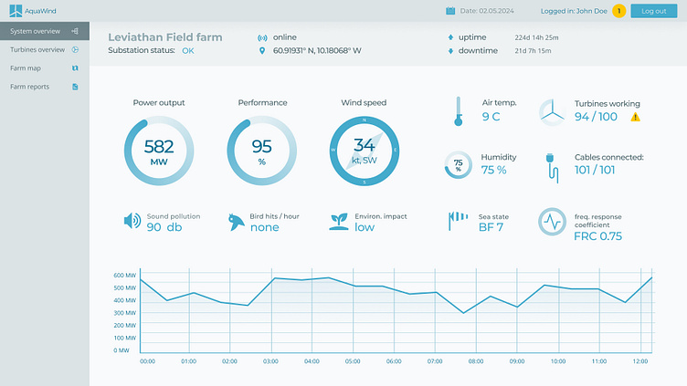
Main screen - farm overview
This is the main screen. On this screen user can see data for the whole system.
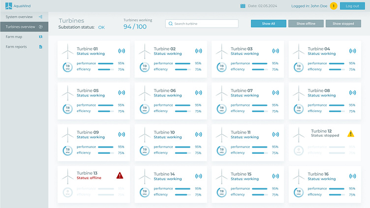
Turbines overview
On this screen user can see list of all turbines, including turbines with a problem or under maintenance.
Farm map
This is the map of the farm. Yellow and red turbines are the ones with some kind of a problem.

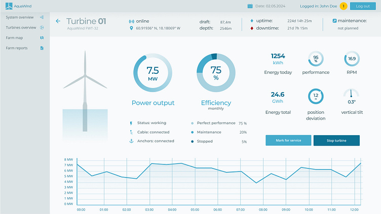
Screen for specific, working turbine
On this screen user can see status and data of specific turbine.
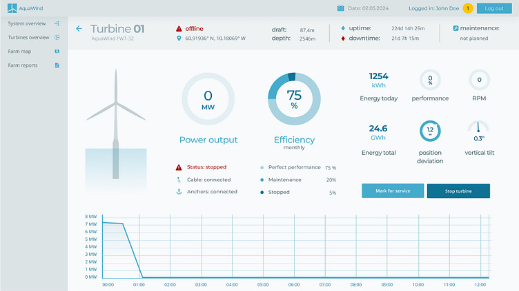
Screen for specific turbine with a problem.
On this screen user can see status and data of specific turbine which has a problem.
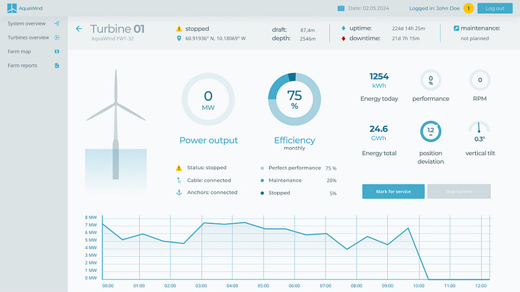
Screen for specific turbine stopped for maintenance.
On this screen user can see status and data of specific turbine which has been stopped by an operator.
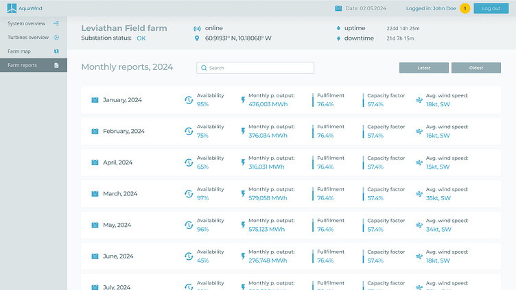
Screen with a list of monthly reports of the farm.
This screen shows list of the monthly reports, every report represented by a list item with basic data indicators and gauges.