🌟 Introducing "To The Point" Logo Design 🌟 🚀 Logo Preview:

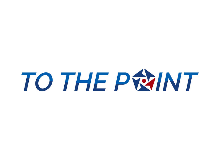
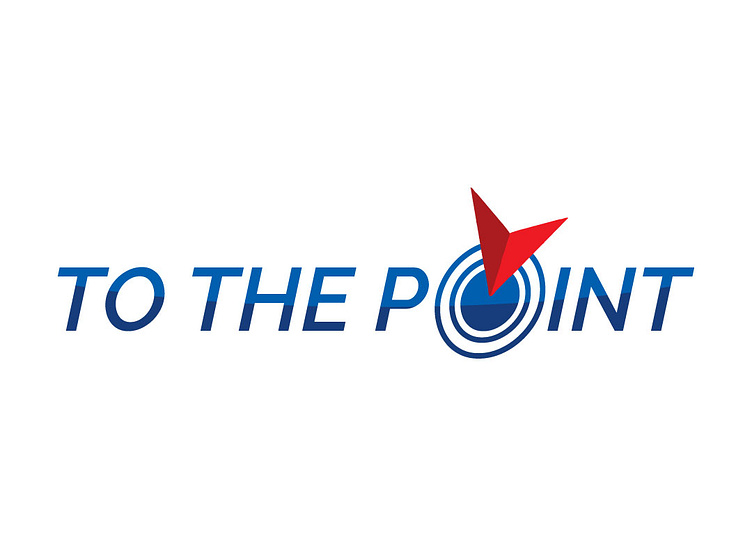
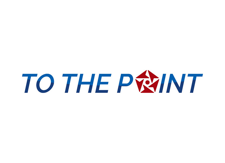
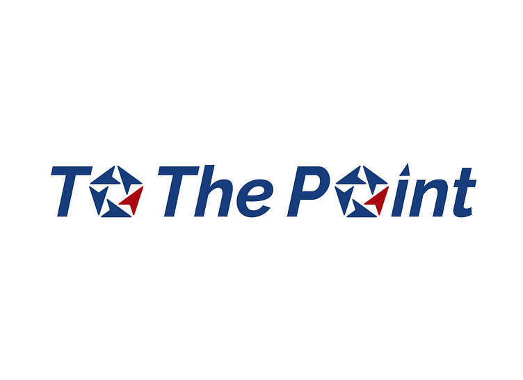
🎨 Concept: The "To The Point" logo is a visual masterpiece that encapsulates the essence of your premium travel consultancy. Crafted with meticulous attention to detail, it effortlessly blends the worlds of travel and points, creating a distinct identity that resonates with your target audience.
🗺️ Design Elements:
Elegant Airplane: A sleek and stylized airplane motif symbolizes the core of your business - travel. It reflects the journey, adventure, and exploration that "To The Point" offers its clients.
Upside-Down 'I' Location Marker: The innovative use of the upside-down letter 'I' forms a clever location marker, representing your expertise in guiding clients to their destination 'point' with precision and flair.
🎨 Color Palette: The logo boasts a refined color palette that speaks volumes about your brand's sophistication:
Deep Blue: Conveys trust, reliability, and depth.
✨ Brand Essence: "To The Point" is not just a logo; it's an embodiment of your commitment to providing top-notch travel consultancy services. The amalgamation of design elements and colors signifies the synergy between your expert guidance and the extraordinary experiences your clients can expect.
🔗 Stay Connected: Explore the journey of 'To The Point' and let's connect:
WhatsApp: 01624164877
Email: zakirhossen.cityit@gmail.com
twitter: https://twitter.com/mamunshak53