AsterCanada - Branding

Hey there,
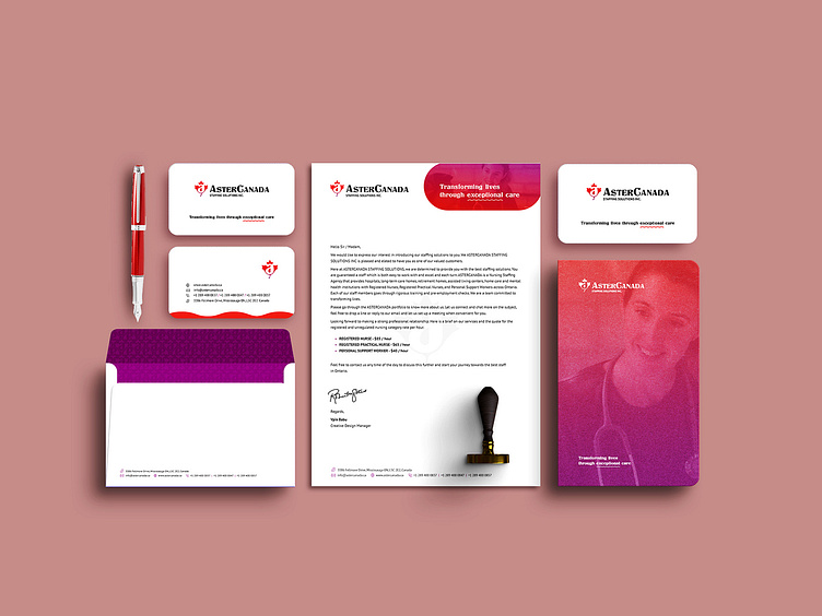
Recently, I was presented with an exciting opportunity to work on a project for ASTERCANADA, which involved creating a logo and other marketing materials such as flyers, brochures, and a website. The client envisioned a logo that would represent Canada in its design while remaining simple. I incorporated the Canadian maple leaf and the letter “A” from “Aster” to create a self- explanatory logo. The gradient colors used are Hot Corail (Red) and Lollipop (Purple), as per the client’s request for an additional color other than the maple leaf red.
Explore my online portfolio 👉🏽 Nuevo Pictures