Analytics at a Glance: Dynamic Business Dashboard UI

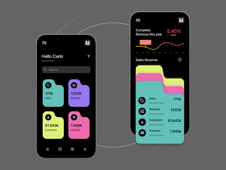
Introducing our latest UI shot, a dynamic business analytics dashboard that brings data to life. 'Hello Carlo' greets users with a personalized touch, setting the stage for a user-friendly experience. This dashboard design features vibrant, color-coded metrics for sales, revenue, customers, and products, offering immediate insights with style. The main screen is a visual treat, with fluid shapes and bold figures making critical data stand out, while the detailed sales revenue graph provides a deeper dive with just a swipe. Perfect for business owners on the go who need to keep their finger on the pulse of their operations.