MEY

Introducing my latest font, Mey.
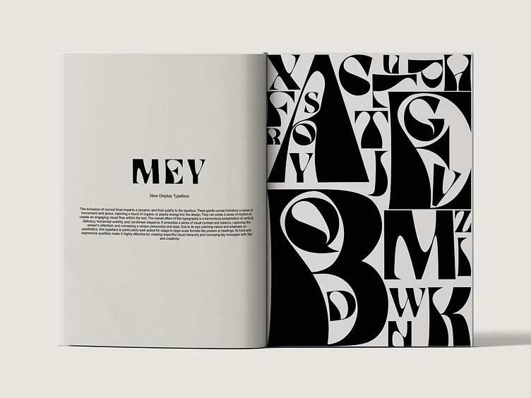
This display typeface exudes a striking and impactful presence, specially designed to command attention and make a bold statement in posters and headings. Its distinctive design showcases a combination of thin vertical lines, thick horizontal lines, and gracefully curved lines, resulting in a visually captivating composition. The thin vertical lines bring a sense of elegance and delicacy to the typeface, adding a touch of refinement to the overall appearance. They create a sense of verticality and can convey a feeling of height or loftiness. In contrast, the thick horizontal lines bestow strength and weight on the typography. They provide a solid foundation and a prominent visual anchor, lending a sense of stability and power to each character. The inclusion of curved lines imparts a dynamic and fluid quality to the typeface. These gentle curves introduce a sense of movement and grace, injecting a touch of organic or elegant energy into the design. It embodies a sense of visual contrast and balance, capturing the viewer's attention and conveying a unique personality and style. Due to its eye-catching nature and emphasis on aesthetics, this typeface is particularly well-suited for usage in large-scale formats like posters or headings. Its bold and expressive qualities make it highly effective for creating impactful visual hierarchy and conveying key messages with flair and creativity.
To take a deeper look at this font check it out on my portfolio link below. https://www.behance.net/gallery/176625837/Personal-Portfolio-2021-2023