Mavik Studios, wordmark by Prateek S.

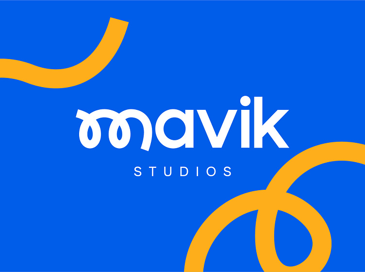
MAVIK Studios, a prominent game development corporation, specializes in crafting exceptional Minecraft experiences for kids under 13. They prioritize immersive adventures, a tight-knit community, and unwavering product quality. Their playful and fun approach ignites young minds, sparking boundless creativity and joy.
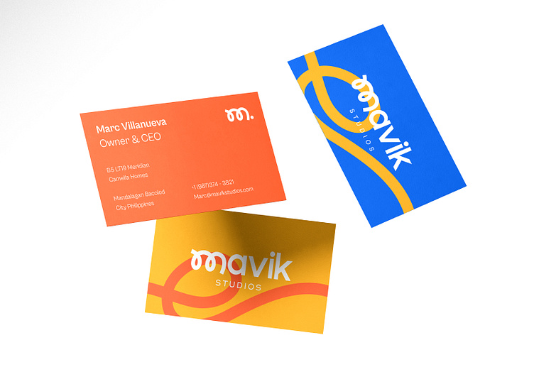
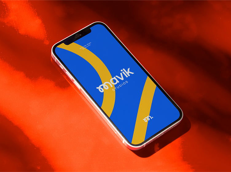
As a designer, my vision for the Mavik Studios' wordmark was to create something truly unique and versatile. I designed the letter M to serve as a dynamic stroke that could seamlessly blend into other branding elements across the entire brand. It had to carry a playful and cute vibe while ensuring readability, making it an integral part of our identity. This distinctive and minimal approach allows us to maintain a strong, consistent presence throughout all aspects of our branding, establishing a connection with our audience and leaving a lasting impression.
Later this year, I plan to share the complete Behance Project showcasing this visual identity project.