Landing page for a travel agency

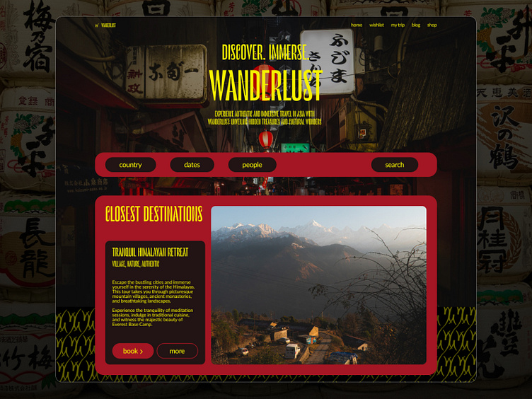
Wanderlust landing page. Why does it look like this?
Big cards remind shapes of online stores. So it is not just a beautiful picture, you can buy it;
Photos take a big part of the screen - the customer is going to visit the place soon. So we give him more details;
Colors – brand identity. They provide obvious associations with Asia and premium quality;
Clear call-to-action;
Search panel to give opportunity to find an appropriate trip.