NFT Application Case Study

Project specifications
Determining the scope and target audience
This project aims to improve my skills in forming a consistent and structured UI library, as well as constructing a prototype of an interface that appeals to the target audience.
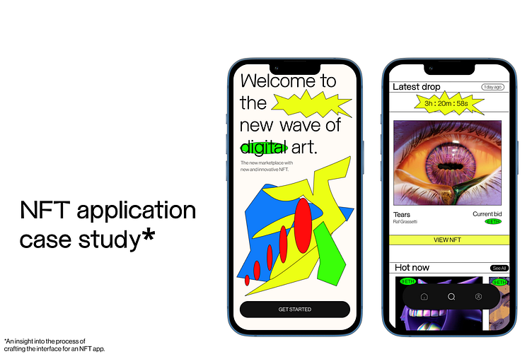
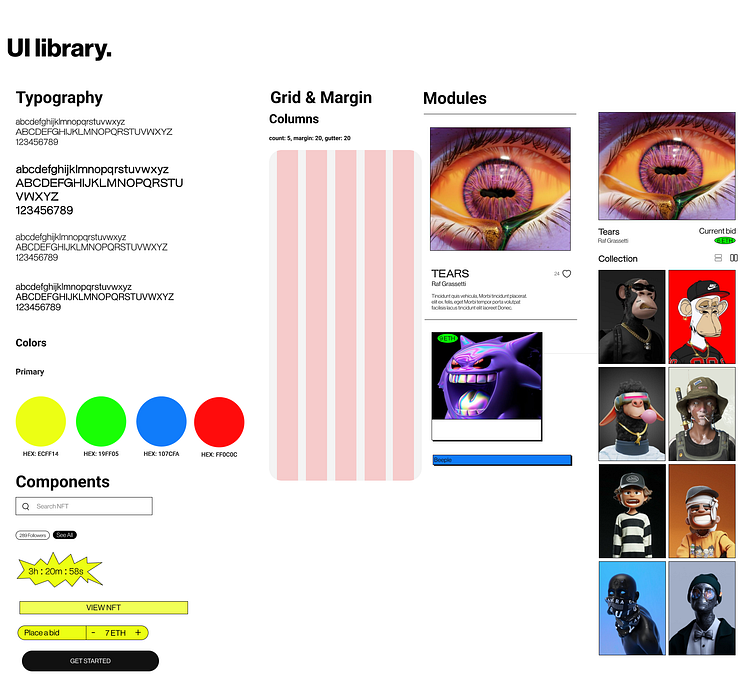
The project's core objective revolves around developing a polished and elegant user interface for an NFT marketplace app. The emphasis lies on ensuring the aesthetics are scalable, impressive, and maintain consistency throughout the entire app.
The app’s primary audience are tech savvy people who have an extensive knowledge of crypto and NFT. They have a strong sense of visual, art and curated experiences. The secondary audience are spectators and people who are curious about the NFT world.
Role
Art direction, visual design, interaction design
My role in this project is defining the art direction of the interface, as well as constructing the app’s UI library and prototype. I am required to keep the design consistent, and appropriate to the target audience, building a prototype that closely resembles a real app and forming thoughtful design decisions throughout the creation process.
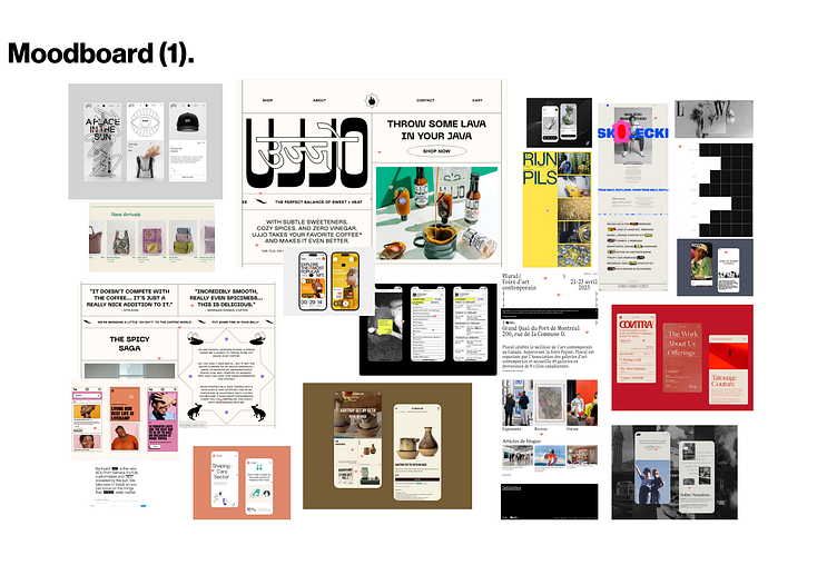
The first mood board is thoughtfully curated from diverse webpages that display resemblances in typography, layout, and the application of elements. Specifically, all these works showcase impressive and unique typography, along with ample utilization of white space. Additionally, a common feature shared among some of these works is the skillful use of lines to effectively segment different parts of the page.
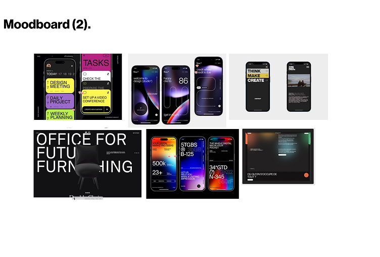
The works in the second mood board have a dark background, with large and impressive sans serif typography to create a visual impact. Most of them are very type-centric and use mostly icons to drive their visual direction.
Key takeaways
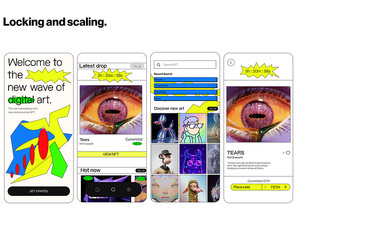
Throughout this project, I was challenged to construct an entire visual direction that must stay consistent and scalable throughout all screens. I also learn and practice the proper design process, and was able to use Figma efficiently to achieve my desired results.
My work impacts the target audience visually: the bright colors help them engage with the app and brings to attention the important elements. The white space in my layout helps balance with the vivid elements such that they don’t overwhelm the user too much. Moreover, the interactions are also simple and intuitive, which helps the user navigates through each screen seamlessly.