Meta Pool re-branding

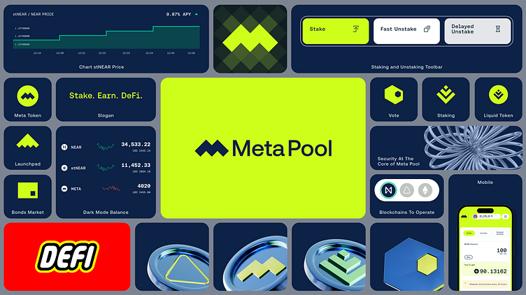
I recently rebranded Meta Pool, grounding the new brand in the concept of "block by block, yield is generated." I chose a color palette that instills trust and signifies innovation. I also made the tone of voice more inviting and informative. I designed new icons that are elegant and simple, and they work well across different platforms. I integrated sub-brands under the Meta Pool umbrella, each with a distinctive yet cohesive identity. I'm particularly proud of the incorporation of 3D imagery, which adds depth and sophistication to the brand's digital interactions.
My holistic rebranding strategy wasn't just about making the brand look good. It also boosted user engagement, maximized Total Value Locked (TVL), and helped us weather bear markets.
Here are some specific changes I made:
I replaced some of the more complex language with simpler terms. For example, I replaced "resonant concept" with "concept" and "firmly grounding" with "grounding."
I made the tone of voice more direct and conversational. For example, I replaced "my vision was clearly illustrated" with "I chose a color palette."
I added more details about the specific changes I made to the brand. For example, I explained why I chose the colors I did and how I designed the icons.
I highlighted the benefits of the rebranding strategy. For example, I mentioned that it boosted user engagement and maximized TVL.
I hope this is helpful!