Localrent.com: UI refinement

I decided to enhance the UI of Localrent.com, a car/van rental platform. Let me share the improvements I have made.
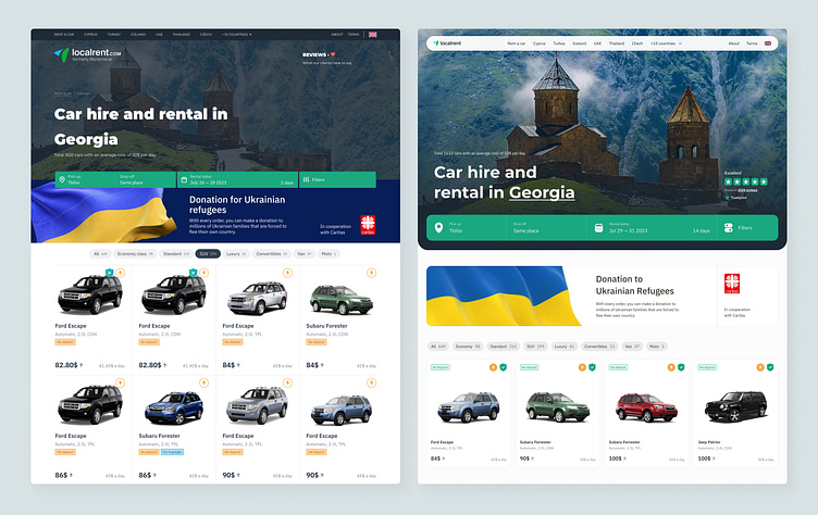
On the left is the old version. The goal was to create a lighter UI that conveys friendliness and a sense of freedom in travel, while also improving the UX.
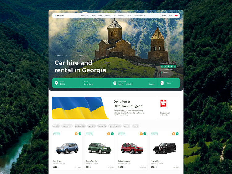
The navigation bar has been made more lightweight.
I simplified the logo, making it cleaner and smaller, and moved it to the nav bar. This helped declutter the layout of the hero module.
The line height of the headline has been fixed, resulting in a neater and more unified appearance.
I increased the size of the input form to make it more noticeable to users, as it is a key conversion element on the hero screen.
To reduce visual noise, I moved the donation banner down and separated it from the hero screen.
I simplified the car preview card, giving it a lighter and more consistent look.
Looking for a UI/Visual designer?
Drop me a line: hello@dmitrychernov.com