Enformion — Sign In Experience

Concept for a login experience with a focus on aesthetics and maximizing usability
Hey Dribbblers,
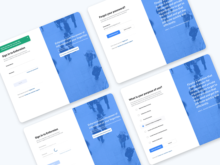
What's the first thing that speaks volumes about a web app? The login experience! Showcasing a collage of four key screens: Sign in, Forgot Password, Reset Password, and Purpose of Use (a screen that asks 'What brings you here?'). Because let's face it, a smooth entrance sets the stage for everything that follows.
Press 'L' if you're all about nailing first impressions, and let's discuss how an app's early touchpoints can make or break user retention.
Key Takeaways to designing a successful login experience:
The primary goal of the login experience is to ensure that the user successfully logs in to their account.
Login involves users entering sensitive personal data like email, passwords and phone numbers — it is a trust sensitive moment that defines their relationship with your platform.
The login flow usually consists of a main login page and a few fairly complex recovery flows, which includes ‘forgot password’, 'resetting password', and alternative methods to login.
It was important to align with the best in class login experiences in the eco-system. I decided to use simple, well- recognized layouts, and well-known terms and copy. This helps users perform a familiar action with confidence and ease. Keeping design simple also helps the experience scale easily to different form factors and devices.
The overall user experience of the online platform needed to continue the simple and clean approach from the branding elements. Visually, this might translate to using the brand colors, photography, illustrations, or even a marketing message. As most design problems, this one’s all about the art of balancing elements in the design. The login action should always take center-stage. Additional elements on the page should be extremely measured, and should not take away any attention from the task at hand.
The less time users spend on the login page, the better. In line with that, the login (or recovery) action should take up all of the user’s attention.
For copywriting, instructing users what exactly they need to do at a particular step is a great idea! Instead of lengthy explanations, a simple ‘Enter your password’ will get the job done. Complicated jargon, technical terms and humorous language have no place in a login experience.
In a recovery experience, it is helpful to break down a complex set of actions into multiple steps. Ask users to do one important thing at a time. Eg: Enter your phone and Enter the code sent to your phone are two separate steps.
Use a large and prominent login button. Keep the number of secondary actions to a minimum — avoid cluttering the page with anything that’s not your core login experience.
At each stage in the login process the user authentication might fail. A wrong email address, mistyped or forgotten passwords, network problems — all of these might cause login to fail. For this reason, it is very important for the login UI to respond to the user in the most appropriate way. Clear, timely, well crafted error messages help here.
In enterprise SSO logins, users may be logged into platforms with multiple accounts. In case multiple accounts are detected, it is best to surface these options to the users and let them choose which account they want to use.