Enformion — Mobile Responsive Design I

Hey Dribbble fam!
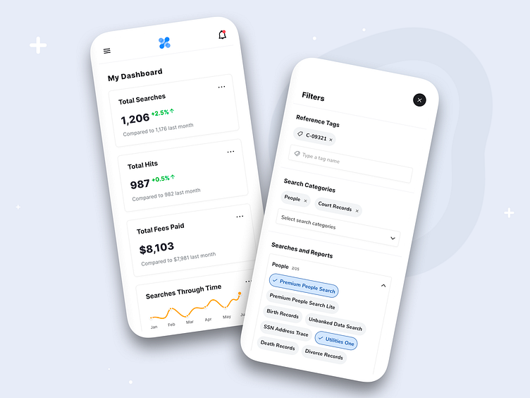
Excited to share my latest mobile design exploration for Enformion — a platform that's all about data-driven insights. Today, I'm showcasing on the left a Dashboard, your go-to hub for monitoring key performance metrics right from your pocket. What's on the board? A card-based UI showing neatly-designed cards: In this shot you see the cards Total Searches, Total Hits, and Total Fees Paid, each giving you a snapshot of your performance with striking, oversized numerals. But I didn't stop there; a comparative label and a nifty trend arrow give you a quick lowdown on how you're faring against last month's figures. Last but not least, the 'Searches Through Time' graph card—a visual chart that turns complex data into easily-digestible insights.
Next, navigate the labyrinth of data with ease, thanks to a meticulously designed Filters screen. Tailored to be user-centric, this full-screen overlay offers a buffet of filtering options, catering to even the most specific of your needs. Use 'Reference Tags' to pinpoint what you're really after or dive into 'Search Categories'—both designed as tag-based mechanisms where you can freely add or remove pills with a simple tap. Want more? 'Searches and Reports' further allows multi-choice selection within collapsible categories, offering layers of refinement without overwhelming you. A tap on 'Apply Filters,' and you're one step closer to the holy grail of data you've been seeking.
Every bit of this design was crafted to offer a harmonious experience across different screen sizes, capable of adapting its content based on the device it is being viewed on. Whether you're a data wizard or a business maven, this design has got something for you. Your path to meaningful analytics has never been this smooth!
Let me know what you think in the comments, and hit 'L' if this resonates with you.