Discord UI: Vision PRO/OS Spatial UI Design

💌 Let's work together to make something great! Contact me.
Prequel
In the glow of the Vision Pro presentation, I felt a surge of excitement. The innovative features unveiled by Apple filled me with inspiration.
A mere few sunsets post-presentation found me immersed in a world of research. New interfaces for the latest Vision OS platform appeared before me like a promising landscape, uncharted and begging to be explored.
As soon as Apple unleashed the Vision OS UI Guidelines, I dove into mastering the art of interface creation for this fresh platform.
Studying intensely for a few days, I picked an app to test my newfound knowledge - Discord. Its intricate interface and thoroughness attracted me. Over the next week and a half, I scrutinized Discord's interfaces on every conceivable platform, aiming for the perfect porting of the interface to this new, unchartered platform for me.
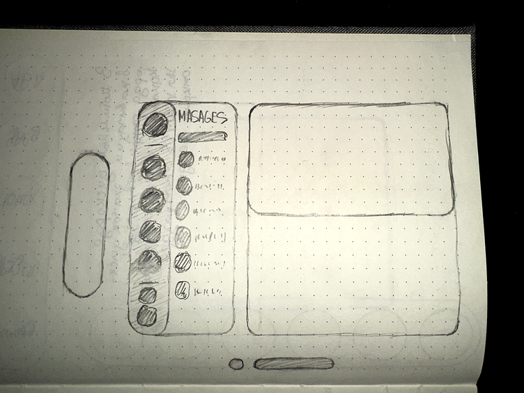
Drawing first sketches
The first thing I started with, of course, was drawing the first flat sketches. The interface couldn't simply be a clone of what was on IpadOS or PC. This was uncharted territory, a new world with its unique form of interaction.
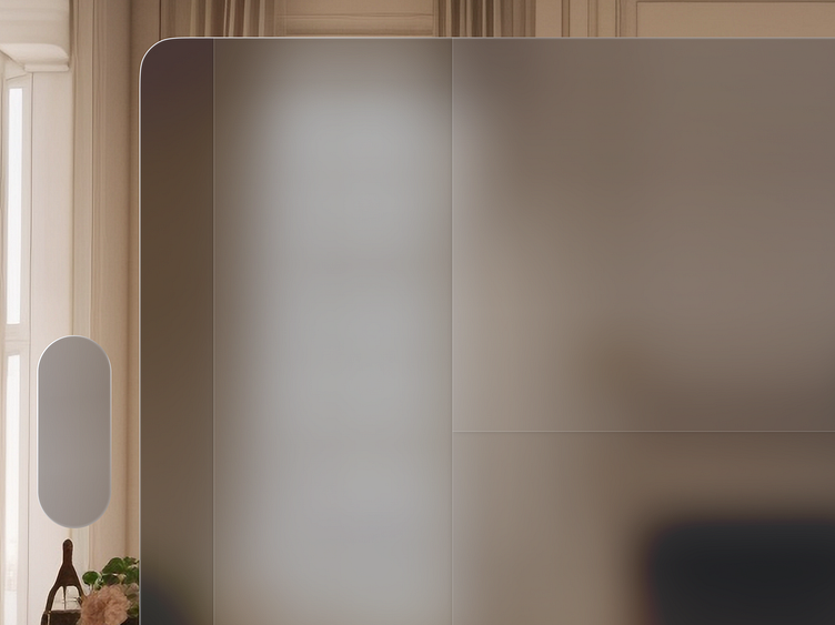
Creating a glass effect and depth
Next on my agenda was a captivating task – replicating the mesmerizing glass-and-depth effect integral to the apps on Vision OS.
A curious observation struck me as I perused app concepts by other designers on Dribbble: a conspicuous neglect for this effect. This observation fueled my determination to master and execute this glasmorphism effect.
It was like an artist who stumbled upon a forgotten, yet magnificent art form, gleefully brought back to life by Apple.
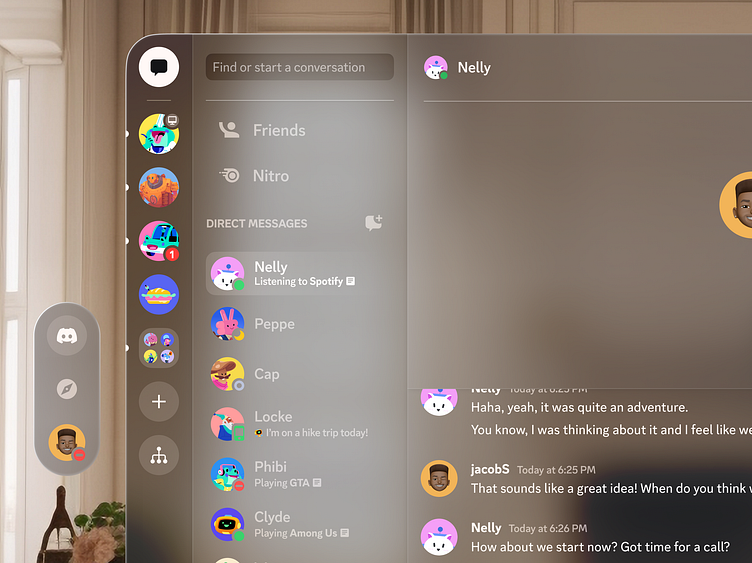
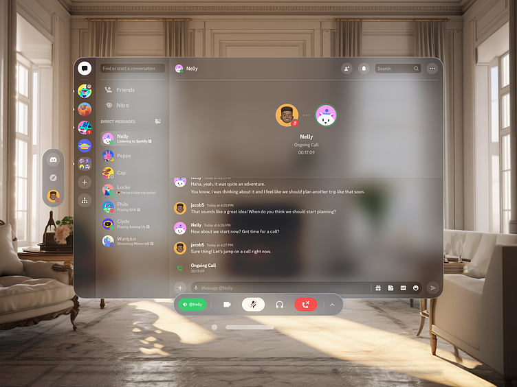
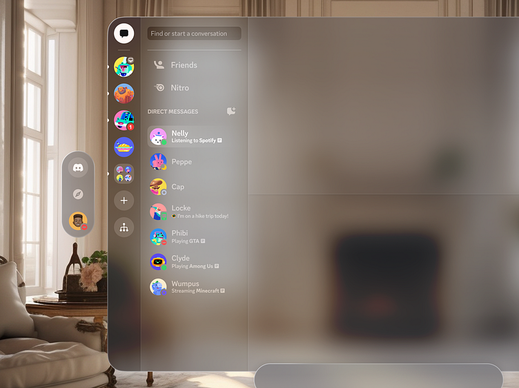
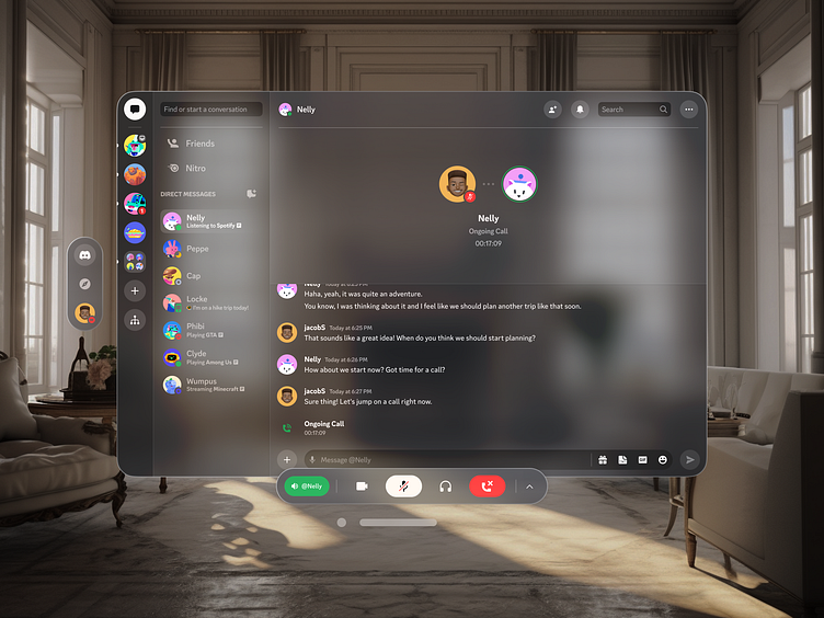
Developing the navigation bar and the Discord sidebar.
Once I had faithfully recreated the glass effect, it was time to tackle the design of the navigation bar, along with the Discord sidebar with channels and direct messages.
The task wasn't simply about design, it was an explorative journey, a puzzle with countless possibilities. I found myself experimenting with numerous configurations, meticulously analyzing Discord apps across all platforms.
The goal was clear: to discern the optimal placement of navigation buttons for the highest level of user experience on this novel platform.

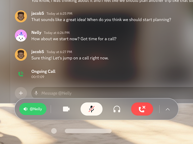
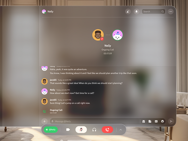
Design of the dialog screen and ornament
For me, the pinnacle of fascination came in the form of crafting the ornament and designing the dialog box. After much pondering, I had a eureka moment – what better place for the Discord toolbar than within the ornament itself?
This ingenious toolbar, granting users the power to mute their microphone or cease a conversation, would be neatly nestled within the ornament.
This ornament, however, wouldn't be an incessant presence. It will appear only when the user is having a conversation, only when its utility is truly called for.
The ornament is a part of the interface which will very often be used as a toolbar in future applications on the Vision Pro platform.
Light room

Dark room
I am very much inspired by the new features Apple has given us and am looking forward to the Vision Pro, the future is clearly near.
🤍 Thanks for watching! 🤍
💌 Let's work together to make something great! Contact me.
lycoris.corp@gmail.com • Telegram • UpWork
Press F on your keyboard to appreciate my efforts!