Timizer - Logo & iOS Icon


About Timizer
Timizer generates activity reports for freelancers, based on their calendars. They're often attached to invoices as proof or overview of work done. It's a no-nonsense and straightforward app with a better design than most competitors.
About the Project
François reached out to me to redesign the logo for the new and updated version of Timizer. He wanted a logo that was both cool and serious, just like the app. Plus it should be easy to print (on generated pdfs) and easy to use as an app icon.
About the Process
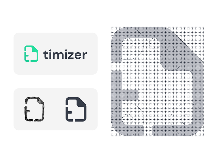
As always I got started on paper and sketched out 45 rough concepts. I combined methaphors for time, documents, tracking, overview, etc. Based on the feedback I made 10 more detailed sketches, further fleshing out the concepts. Two of them were digitised and the chosen version is presented here. The logo works well both as a logo and app icon, and to make sure the logo is pixel perfect on a lot of sizes I used a logo grid.
–––––––––––––––––––––––––––––––––––––––––––––––––––––––––––––––––––––––––––
Thanks for reading! Hit that ❤️ and let me know what you think.