LATTO© Brand Identity

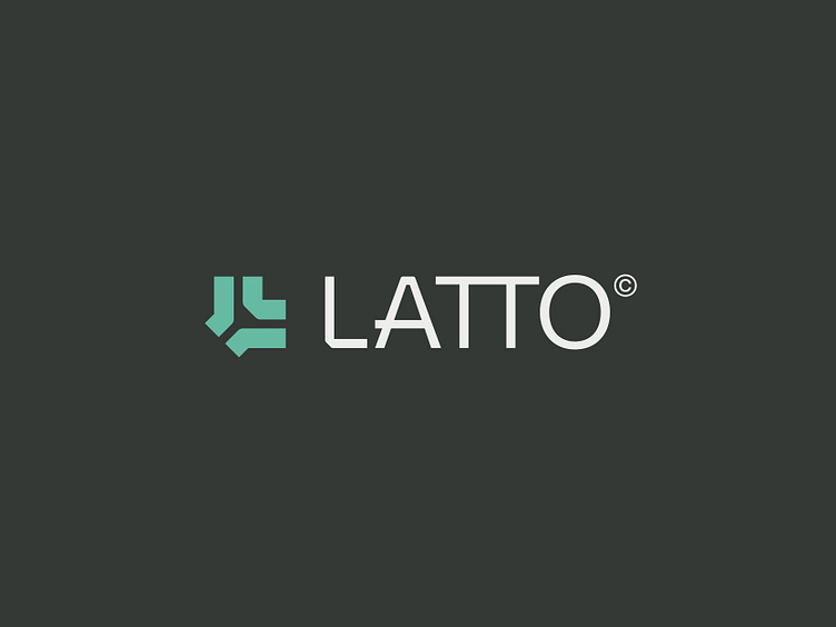
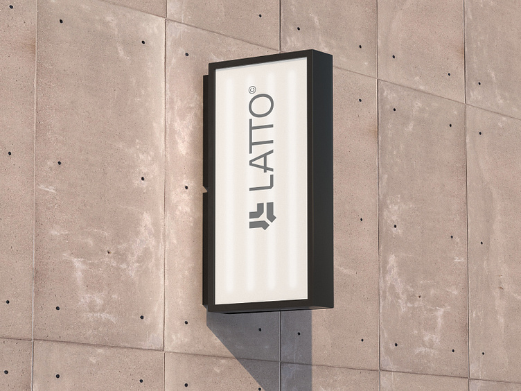
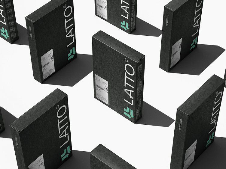
LATTO offers international transportation and freight services. They are specialists in logistics solutions, aiming at the user experience and deliveries in record time.
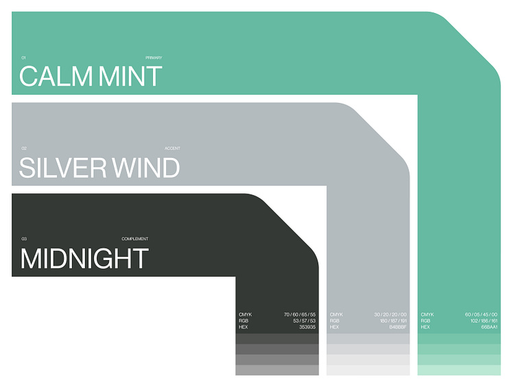
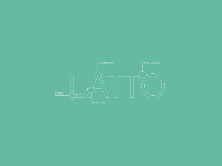
For this project we needed to focus on professionalism, structure and positioning in the market in order to provide a strong, timeless and representative solution. The symbol is inspired by trucks and arrows, giving it a robust and fast delivery look. Furthermore, we created a unique typeface for the project based on the details of the symbol, making it distinctive and readable at the same time.