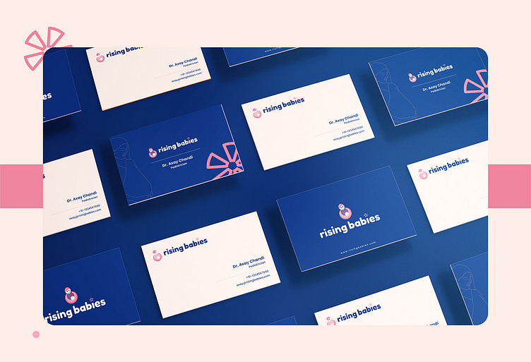
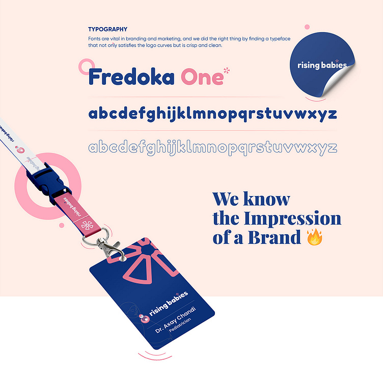
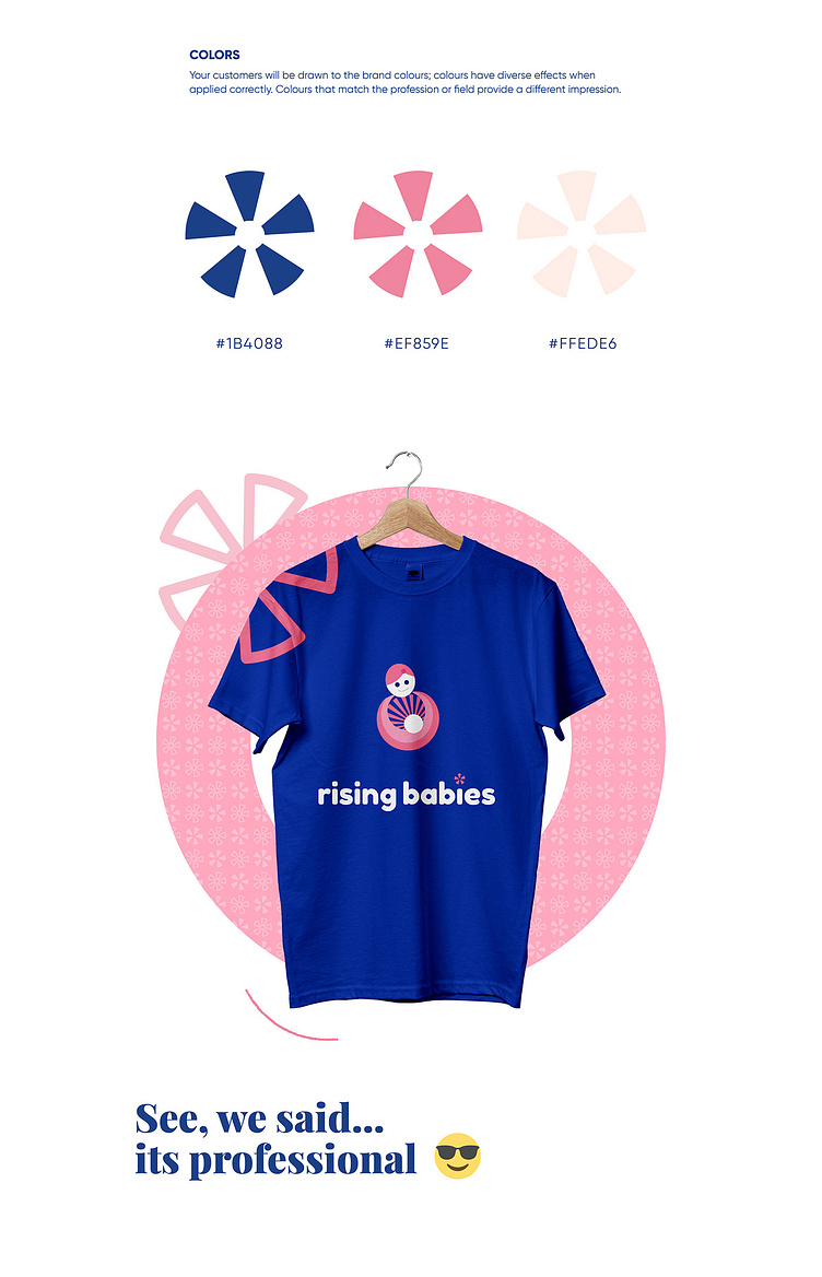
Logo & Corporate Identity for a Medical Brand 🎨 ✨

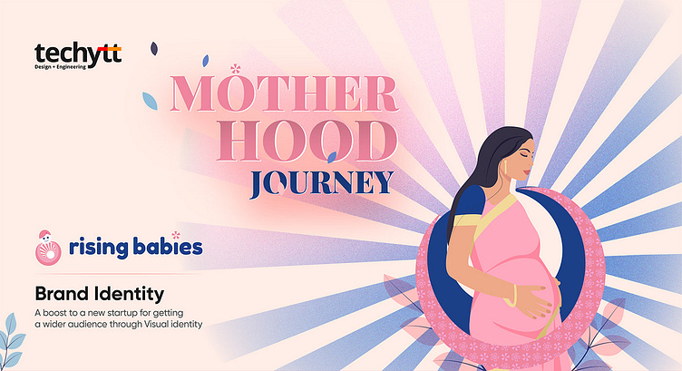
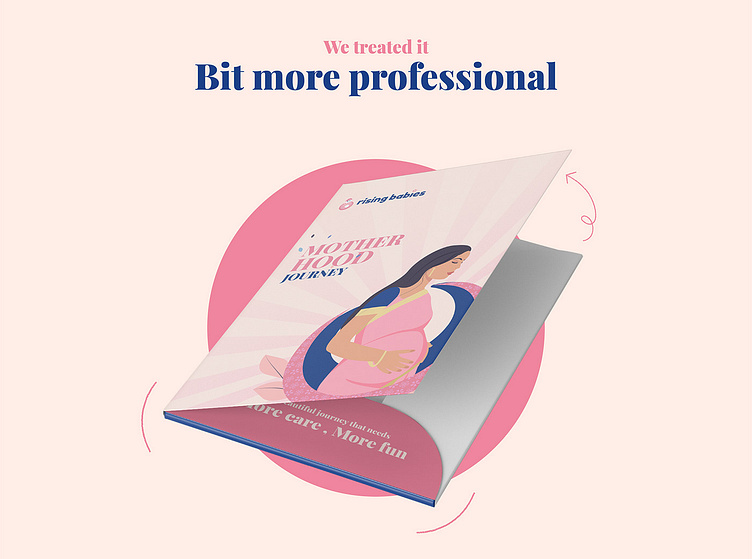
A beautiful journey that needs
More care , More fun
Rising Babies is a brand that promotes pre and post-pregnancy care for mothers. We were called to give it a brand-like feel and to reflect client trust right from the branding. We assisted in the creation of a platform that gives expectant mothers access to a variety of features and tools, such as personalised pregnancy plans, dietary assistance, fitness routines, pregnancy tips, and much more. We've also included a community component to the site to provide mothers a place to share their stories, ask questions, and seek advice from other mothers who have been through or are currently going through the same journey.
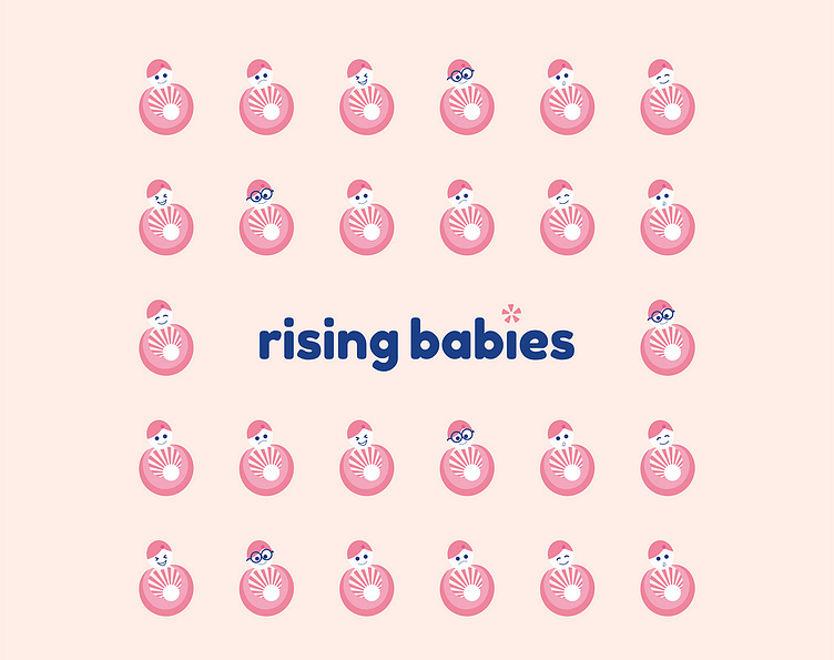
The Symbol
The symbol represents the mother and child rising in her womb. It represents the love and care a mother desires for her growing child. Beautiful, love, purity, and care are some of the words that spring to mind while seeing the sign that represents trust and faith.