Creating a Design System


This project was created for educational purposes as part of the Dribbble Scaling Design System course by Dan Mall.
Challenge
IPTS is a forward-thinking transportation company that provides intergalactic travel opportunities to locations within our galaxy. In preparation for its Initial Public Offering, IPTS strategically brought its three new flagship products within a tight timeframe.
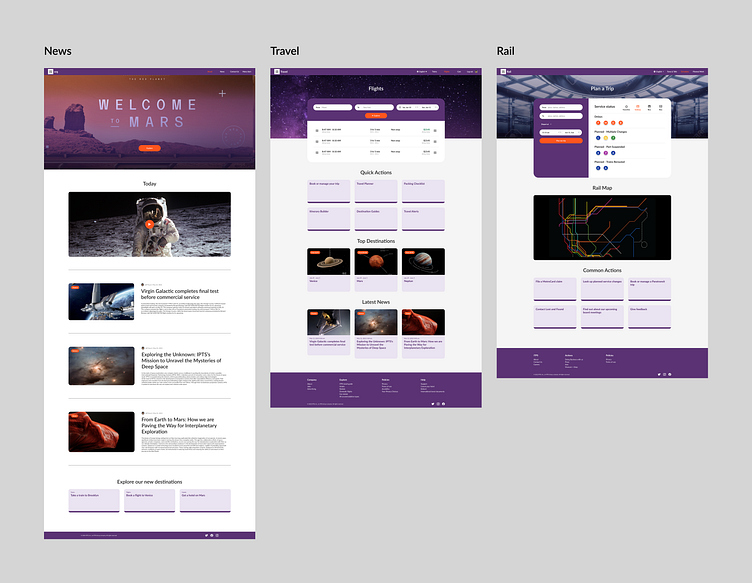
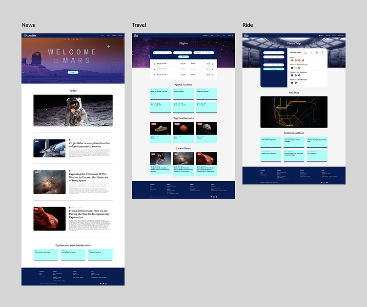
IPTS.org - an informational website where you can find the latest news and happenings with the IPTS.
IPTS Travel - allows users to browse and book travel to multiple destinations within our galaxy.
IPTS Rail is a real-time updated web app where you can view lines, routes, and times for all commuter lines.
I was tasked to develop a scalable design system reflecting the brand's values, personality, and future-oriented vision.
This case study will walk you through a journey of crafting it and showcasing the obstacles I encountered and solutions to overcome them.
Solution
Using a design system is supposed to improve brand recognition and user engagement using consistent visual language. It's also expected that the design and development process will enhance the company's efficiency and substantial cost savings. This cohesive approach should ensure a seamless user experience across all digital products.
Tools I used
GPT Chat (Language model AI assistant): to generate product copy and create the content architecture.
Unsplash, NASA: images
Figma: components, documenting the process, design tokens, wireframes.
Starting from scratch
After reading a brief from the company, I got panicked. I had so much to do and didn't know where to start. I realized that to create three digital products, I would have to wear at least three hats: brand designer, product designer, and copywriter. I decided to start by outlining my working process:
Content research inspiration
Visual design research inspiration
Low-fidelity wireframes
Design system architecture and inventory outline
Mid fidelity wireframes
High-fidelity wireframes
Components
Design tokens
Content research + Low-fi wireframing
First, I started looking for content inspiration and decided to use the following websites as a reference:
ITPS.org - Washington Post
ITPS Travel - Expedia
ITPS Rail - Metro website
I had no idea what components I needed and how many I had to build, even after looking at similar websites. I used Chat GPT to define each product content preliminary architecture and then started wireframing. The process helped me find similarities and see what parts of the content I could reuse among all the products.
Tip: I always prefer to wireframe in Figma. But I had a very tight time frame this time, so I had to move fast. It was my first experience when hand drawing for initial low-fi wireframing was much more efficient than using Figma. It let me see the bigger picture and patterns and shape preliminary product structure without going into detail and getting distracted. It was fun, I felt creative, and I was moving forward.
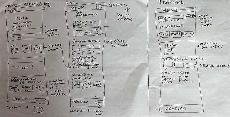
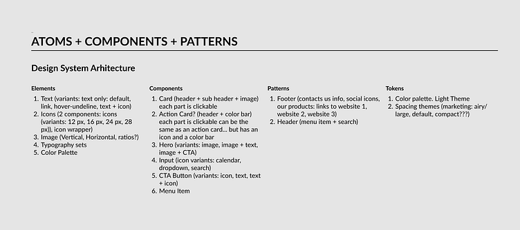
Defining Design System Architecture
Following Brad's Frost approach, I decided to establish what content should be elements, components, and what might be whales - patterns or layouts. Again, I had a lot of questions and doubts, but I needed something to start with, a spine that I could improve in the future, so based on my low-fi wireframes, I just sat down, made my assumptions, and wrote them down. Here is how it looked.
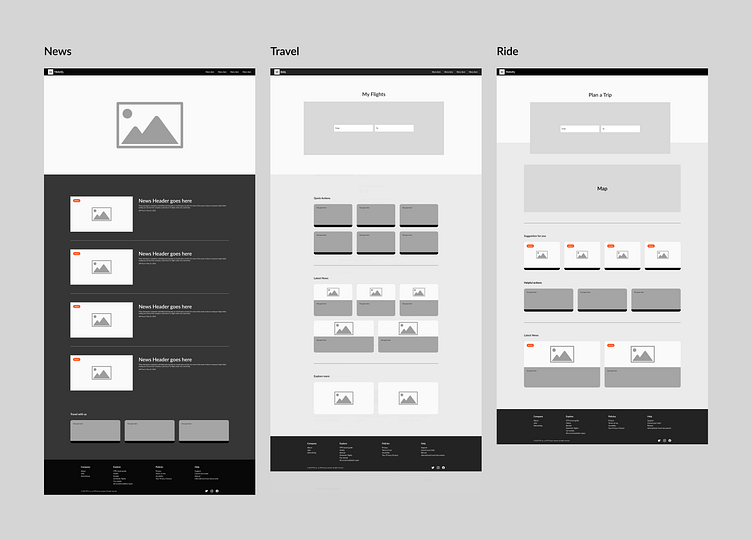
Mid-Fidelity Wireframes
After drafting my design system architecture, I moved to Mid-Fidelity wireframes. They were still pretty general but they helped me see what parts I use the most and where I probably should start with components.
Working on components
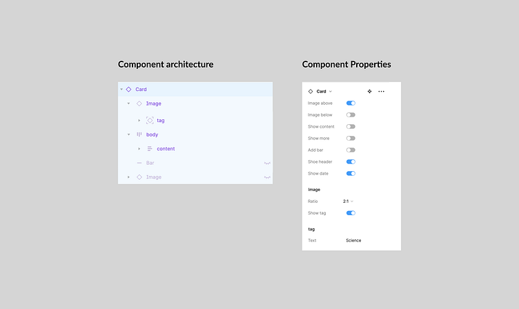
After finalizing mid-fi wireframes, I realized that a card was the most often used component for all 3 products I needed to build. And I decided to start with the following:
Research how other design systems approach a card component.
Analyze what works for my product and what might not work based on my designs.
Discover different layouts and define what option works the best and why.
I was tempted to create a lot of variants to cover all possible use cases, including a horizontal option. It seemed useful. But I was questioning myself:
Where should I stop?
How do I know how many and what kind of use cases I will have?
I got stuck, and I was wasting time. Then I decided that I would finalize my products first, and If I see the need to have additional variants, then I will add the necessary ones. But not before I know that I need them. It moved me forward.
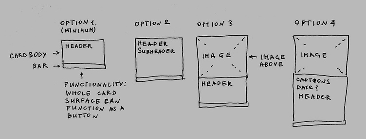
Then I built the component in Figma.
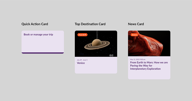
During my research, I liked the Ant Library approach for a card. The library had an image as a separate independent component with different ratios. All 3 products I was building heavily used images, so I created a component with multiple ratio variants and embedded it into my card. It gave my card additional layout flexibility. I also embedded a tag component directly into the image block instead of placing it into a card. So if I wanted to put the image below the content, I didn't have to think about how to solve the tag placement variety.
I needed to know how my products would look to move forward with the rest of the components. For that, I had to:
1. Work on high-fidelity wireframes
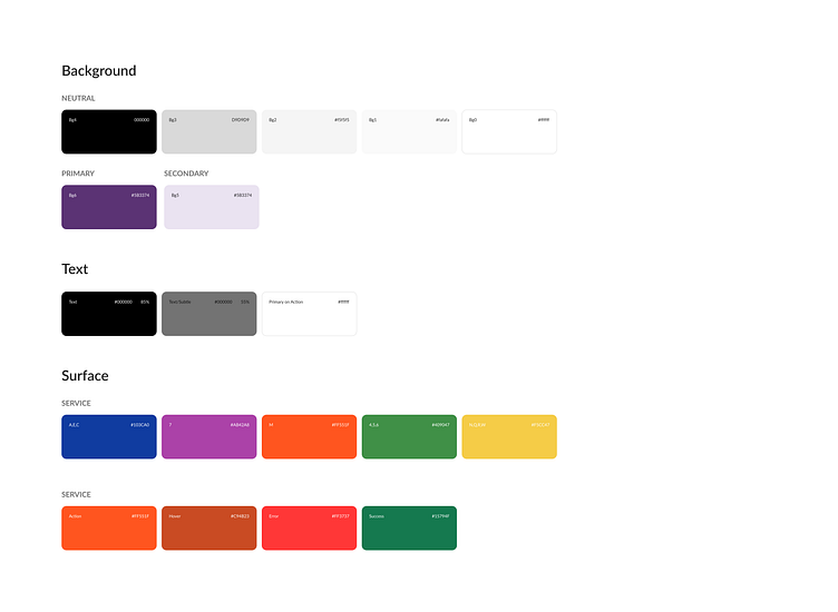
Define my color palette
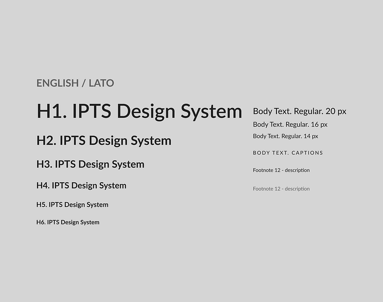
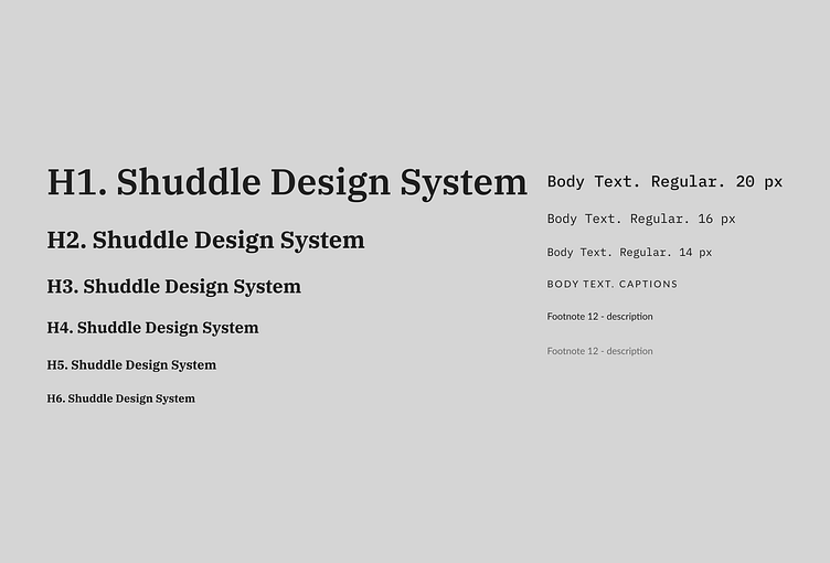
Create a typography set
Everything was happening on a fly and kind of at the same moment. For example: I would work on a schedule layout and at the same moment I would draft all the necessary components and convert colors into tokens to speed up the process. Then I would polish hi-fi designs or make the component adjustments if it was necessary.
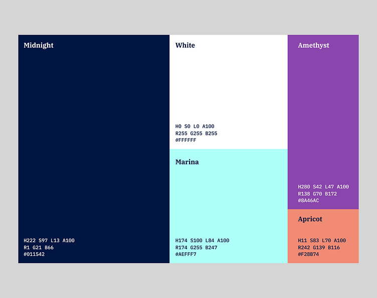
Pivot
When I finished my products and components, the leadership changed its mind and decided to take a different brand direction, including new color palette, new typography, and even renaming the company. Here are the new brand elements:
Magic swap
Though all 3 updated products still need some color and other brand adjustments after I swapped libraries, the power of having a robust design system became absolutely obvious.
Conclusion
You could make considerable changes in seconds if you:
1. Did good leg work with architecting components
Created color and typography tokens
If you have a design system - It doesn't matter how many pivots are waiting for you in the future - you can always keep your visual language holistic and under control saving time for development.
Moreover
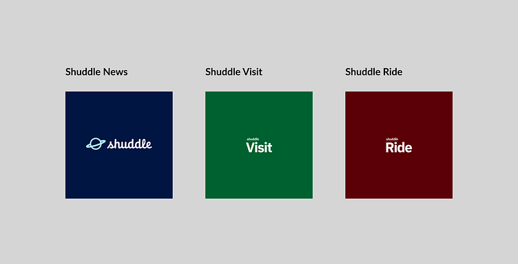
Having a design system in place further exemplifies the scalability of your products. The content I created can be seamlessly utilized across the various offerings. For instance, Shuddle can incorporate components such as Input fields, date pickers, cells, accordions, and icons when operating a rail station ticket terminal.
What I learned
I think I made all possible mistakes working on this design system. I learned a lot of lessons, but I would probably highlight the following:
Always prioritize working software over comprehensive documentation
Keep the collaboration between development, designers, and product teams tight. Communication is everything.
Next steps. "The only true wisdom is in knowing you know nothing."
That's funny that the more you learn, the more you feel like there is so much out there you need to know. This project highlighted that I need more practice with design tokens and naming conventions to enhance the design system's functionality. That was my blind spot, and I hope to improve it.
I was fortunate to have a fantastic mentor Vlad Burca, who gave me endless Figma and design tips. They were pure gold and completely turned things around in areas where I was feeling desperate. I always knew the importance of learning new things, but now, more than ever, I understand the significance of crafting and enhancing my design skills.