Notch - A Greek Softdrink Company


Company Name: Notch
Company Description: We are a company that makes and distributes Greek soft drinks. Our main product is made with a secret recipe and served in your favorite diners. Our target audience is people who live alone. We want to convey a sense of mystery, while at the same time being inexpensive.
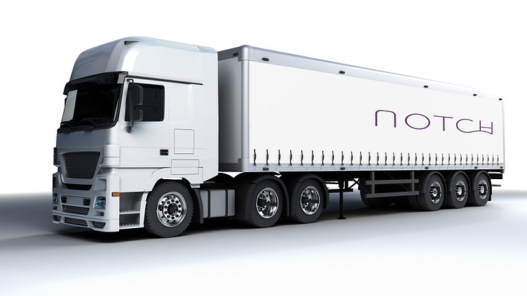
Job Description: You must create a logo using the information given in this brief. They would prefer a wordmark that uses the color purple. The logo will be printed on the side of vehicles. Take into account the company's values and preferences, and make sure it will work for the planned use-cases.
Logo Font
Spartan - Light
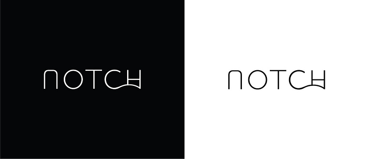
Logo Design Concept
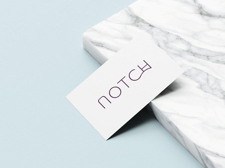
The chosen font for the brand "Notch" caters to an audience who live alone and value their freedom. The thin font with larger gaps between the text creates a sense of spaciousness, symbolizing freedom and individuality. Each letter has its own distinctiveness, emphasizing the uniqueness of the brand's target audience.
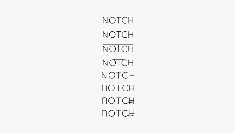
The letter 'N' in the logo design is not a simple 'n' but represents the concept of a "U Notch." In engineering, a "U Notch" refers to an opening in a tank or vessel, positioned in a way that the liquid surface inside the tank is below the top edge of the opening. This imagery of an opening or gateway signifies the brand's emphasis on providing a sense of freedom to its customers.
The letter 'C' in the logo design features a flowing line at its bottom, symbolizing fluidity and a free-flowing nature. This conveys the idea that the brand deals with liquid-related products or services and further reinforces the concept of freedom.
The letter 'H' in the logo design adds an element of mystery by partially hiding behind the lines of the letter 'C.' This subtle visual detail creates intrigue and curiosity, inviting the audience to explore and discover more about the brand.
Lastly, to convey a sense of affordability or being inexpensive, a minimal approach is taken in the logo design, using a lightweight font. The simplicity of the font choice suggests that the brand focuses on providing value and cost-effective solutions.
Overall, the logo design for "Notch" effectively captures the essence of freedom, individuality, fluidity, and affordability, catering to an audience who live alone and embrace their independence in making lifestyle choices.
Logo Iterations
Logo Colors

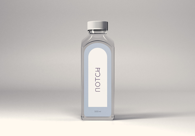
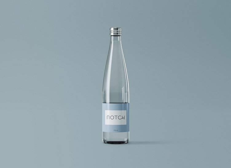
Logo Mockups

Thanks for visiting my project!
I hope you like it, Don't forget to APPRECIATE! and any feedback is welcomed.
If you have any project then Let's talk about it!
Say Hello: danesh.tolani@gmail.com