Landing And App Game Design

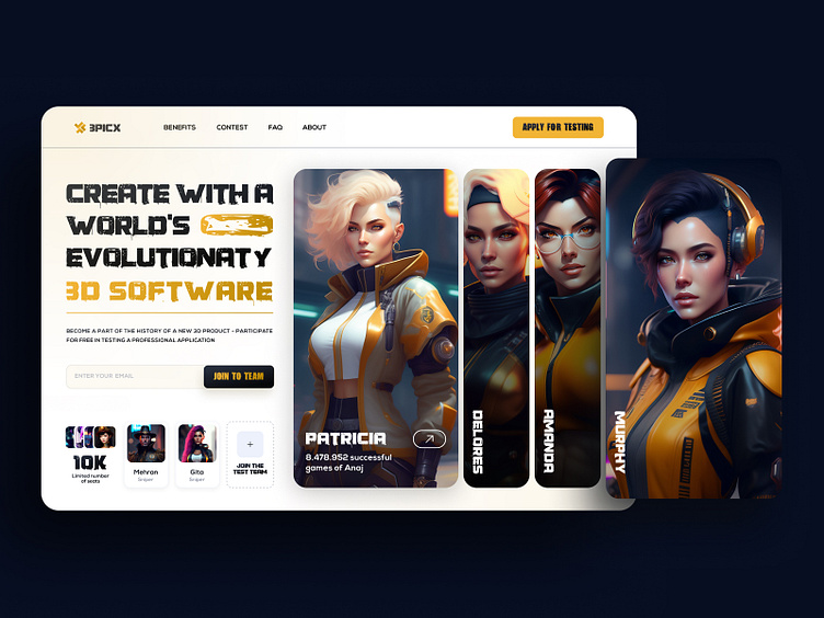
The UI design of the game website that we recently worked on was focused on creating an engaging and visually appealing hero section. The hero section is the first thing that users see when they visit the website, so it was important to make it stand out and capture their attention.
To achieve this, we decided to use character photos that show the number of members in the game. This not only adds a fun and playful element to the design but also highlights the popularity of the game. The use of numbers (10k) also creates a sense of community and encourages users to join in.
In terms of color palette, we opted for a light mode design with white and orange colors. White is clean and modern, while orange adds a pop of energy and excitement. This combination creates a fresh and vibrant look that is both inviting and easy on the eyes.
Overall, our goal was to create a UI design that not only looks great but also enhances user experience by providing clear information about the game's popularity. We believe that our hero section design achieves this goal by effectively communicating key information while also being visually engaging.

