


On The Go photo exhibition visuals

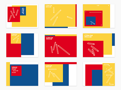
We are currently working on the branding of an exhibition in the heart of Luxembourg called On The Go. The exhibition is about the differences and similarities of Asia and Europe. Red and blue stand for those continents. Yellow and white are used additionally to create some visual tension. The "O" was transformed into a playful keyvisual and symbolizes movement and agility. The exhibition will start in Luxembourg and later travel to Singapore, Mongolia and probably several other countries. We also designed the website: www.asef.org/onthego and will publish a photo-book featuring the best works. Btw you can submit yours through the website as well.
Hit "L" if you like it :-)