Perfect Pear

Perfect Pear is a Canadian PR agency, and we teamed up with them to create their new brand identity. A company that puts client relationships at the heart of everything it does, our challenge here was to put this differentiator front and centre in the new branding.
And in an industry that can sometimes feel a bit corporate and impersonal, Perfect Pear is the opposite of that, wanting to be a truly collaborative extension of its clients’ teams. So the message we had to communicate here was that working with them is all about partnership, trust, and reliability.
This fresh perspective was then the driving force behind our inspiration, and we set about creating an identity that conveys a positive, engaging, and mutual client experience, and also one that encourages confidence in the quality of work.
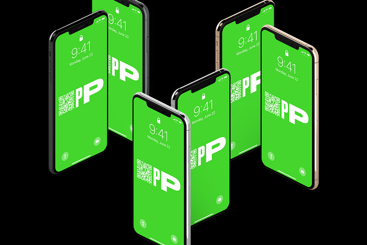
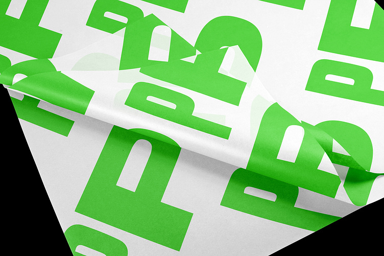
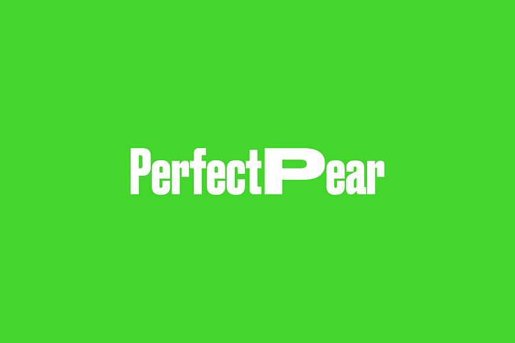
This started with a logo that represented this idea of a partnership. In the main feature of the logo, the 2 “P’s”, we stretched one of these letters (using the Wide weight of the Druk typeface). When brought together into “PP”, we wanted this to reflect the idea of client and provider coming together - 2 different, yet similar, parts of the equation, united in a singular vision.
We also quite liked the idea of conveying Perfect Pear’s fresh perspective by actually playing with the perspective of the letters.
This widened feature of the typeface is maintained throughout the marketing materials of the brand, and gave us a great tool to apply that unique and fresh touch, and to introduce playfulness into the brand voice.
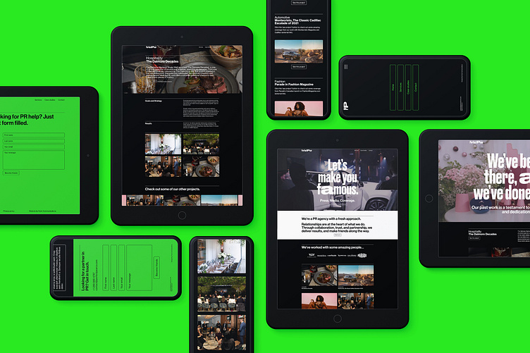
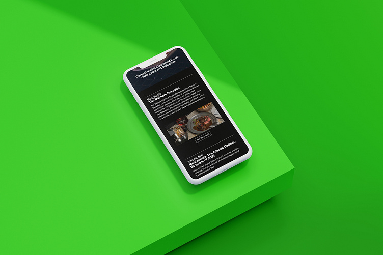
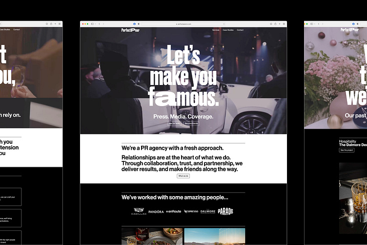
The most important place for us to bring this new branding to life was on the Perfect Pear website. Taking the visual identity we had created, it was important that the website felt like something new in the PR industry - a completely fresh voice in the field.
With a vibrant colour palette carefully balanced throughout the site, we wanted to use this energy to help attract a like-minded clientele who were looking for an innovative and forward-thinking partner.
The energy of these colours, and the boldness and playfulness of the Druk typeface, were also the perfect supporting cast for the brand voice we wanted to establish - one that was confident, accessible, and also conversational.
And by being human, and occasionally tongue-in-cheek, we could prevent confidence from spilling into arrogance, and also convey the key brand value of trust. We could balance being light-hearted with being professional, to ensure we never detracted from the seriousness of the work.
And as you navigate the website, this feeling that the brand is having a conversation with you was the ideal way to put partnerships and relationships at the centre of the experience.
We also said in our last post that this visual identity needed to encourage confidence in the quality of Perfect Pear’s work. And communicating confidence to the world starts with the brand having confidence in itself, which this one does.
The result is a website that presents a brand you can trust and an agency you can rely on.
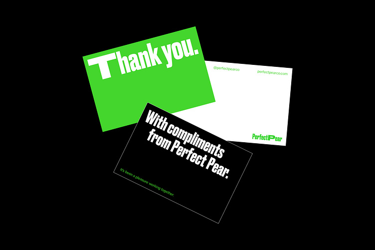
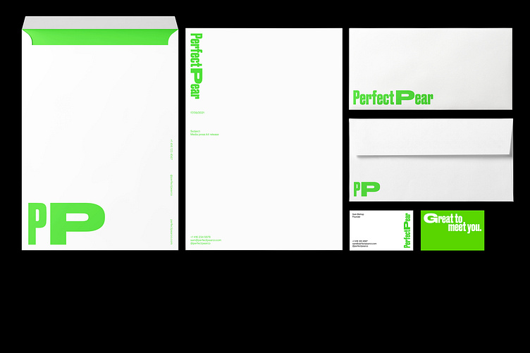
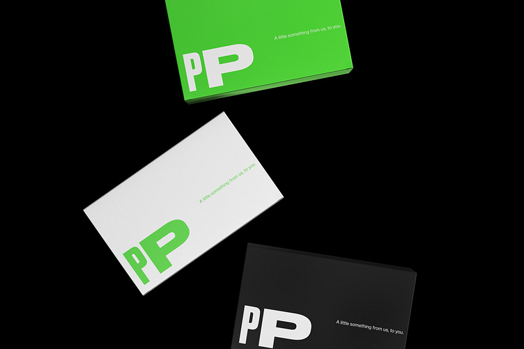
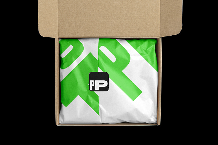
The next place for us to turn our attention was the Perfect Pear print assets. Again, as a PR agency so focused on relationship-building, it was important that we could complete the client experience through branded gift packages, thank you cards, and other such materials.
The brand voice here continues in being human and approachable. And by being so consistent (both visually and tonally) from the start of the client experience to the end, we authentically reinforce the Perfect Pear brand values: partnership, trust, and reliability.
See more of our work at: fookcommunications.com