Equis Capital Logo Concept

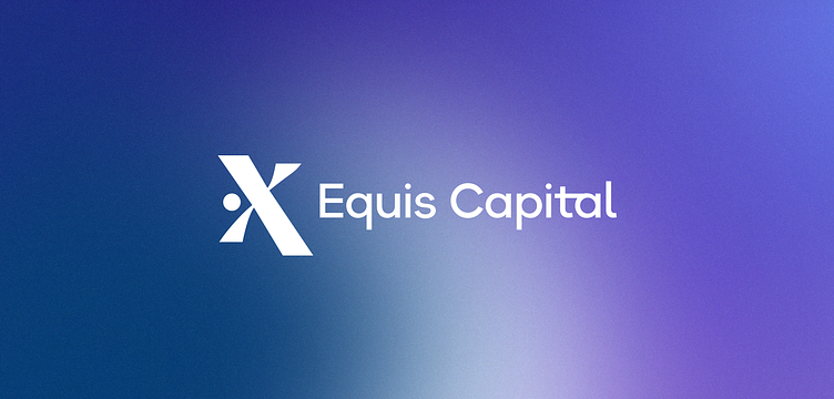
Equis Capital Logo & Brand Identity Design
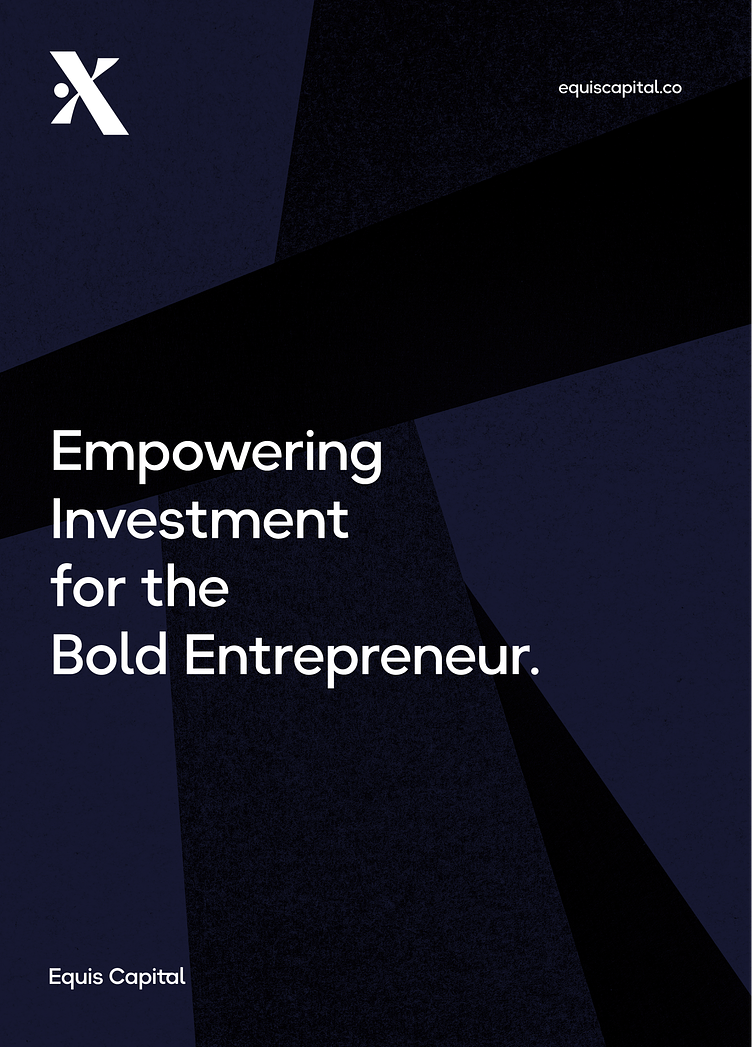
Equis Capital, a real estate private equity fund, required a captivating logo and brand identity that accurately represents their innovative and forward-thinking approach. The symbol I have crafted for Equis Capital is an "X" with a central dot.
In the process of designing the symbol, the goal was to create an emblem that not only embodies the organization's values but also stands out as distinctive and modern.
The "X" symbolizes the essence of Equis Capital, representing their commitment to exploration, growth, and the crossing of new frontiers in the real estate industry. The addition of a dot at the center of the "X" signifies a focal point, highlighting their meticulous attention to detail and precision in investment strategies.
To convey Equis Capital's contemporary and inventive character, every aspect of the logo design incorporates sleek curves, carefully selected colors, and a clean, modern typeface. The brand assets employ an appealing gradient, drawing the viewer's attention and contributing to a visually striking and memorable brand identity. The result is a logo that encapsulates the essence of Equis Capital while exuding a sense of professionalism, innovation, and a progressive outlook.