Cubeking - Logo Branding


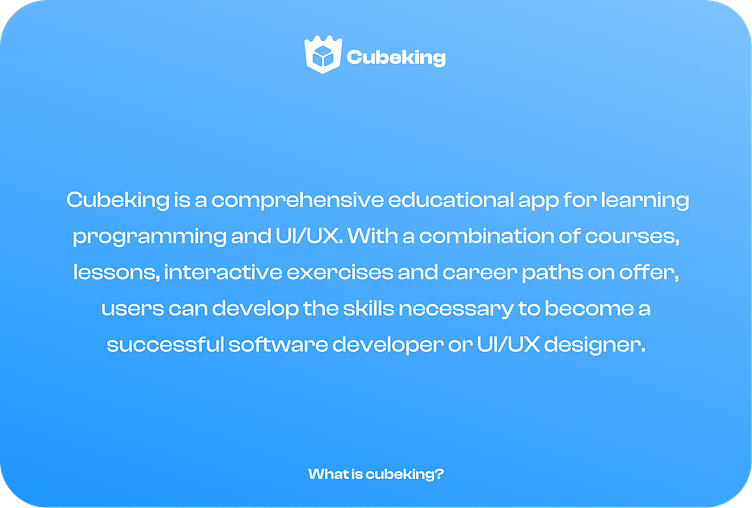
Cubeking Explanation
The Cubeking logo is a combination of a crown and a cube, symbolizing its name and the essence of the brand. The logo features a stylized cube with a crown integrated into its design. The cube represents the technological and programming aspect of Cubeking's focus on software development and UI/UX learning.
The cube, with its sharp edges and defined angles, represents structure, logic, and problem-solving inherent in programming. It signifies the foundational knowledge and skills that users can acquire through Cubeking's courses and resources.
The crown element represents excellence, mastery, and achievement. It symbolizes the goal of Cubeking to empower its users to become kings or leaders in their respective fields of programming and UI/UX design. The crown also suggests the notion of royalty, indicating the premium quality and expertise associated with Cubeking's educational content and resources.
By combining the cube and crown, the Cubeking logo visually represents the blend of technical proficiency and mastery that users can achieve by utilizing the platform. It conveys the message that through Cubeking, individuals can attain a higher level of knowledge and expertise, positioning them as leaders in the world of programming and UI/UX design.