Rasa Visual Identity Design

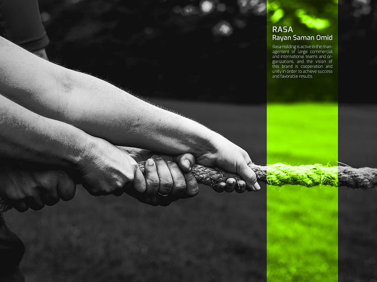
Rasa Holding is active in the management of large commercial and international teams and organizations, and the vision of this brand is cooperation and unity in order to achieve success and favorable results.
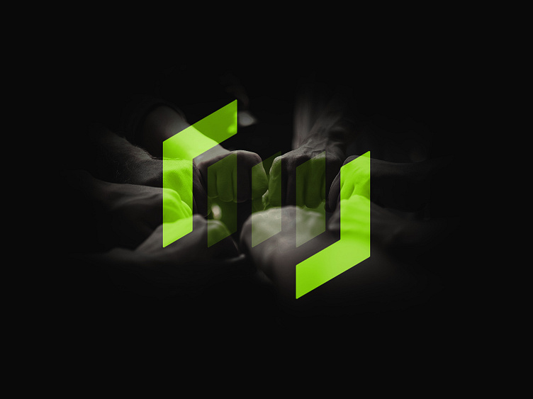
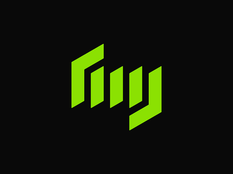
In designing an expressive brand logo, formality was the main goal because the customers and contacts of this brand include companies and organizations. We designed this logo to convey a formal and powerful visual tone. At this stage of the design, additional visual details are not used and the logo structure consists of five parallel lines of the same size next to each other.
The keywords protection and safety to convey to the audience in the visual content should be considered as a border around the main design. This is done by two lines, two lines that have created a safe margin by breaking their angle.
The cutting and breaking angles of the lines are carefully chosen and show the precision and elegance of Rasa's brand vision. All angles have been considered with precision and order.

Unity and coherence in activities and expressive works are the first goals of this brand. In the design, we tried to show this unity and integrity in the simplest possible way with only three or three similar and special lines that are placed next to each other in a precise and orderly manner.
The precise and specific angle of the cutting lines is chosen to show a sense of distinction and specialness, and more importantly, accuracy and precision in the brand's attitude is also part of the concepts hidden in this logo.