Shuddle: Design System Case Study


Background
This is a Dribble Design System Course project with 2 phases.
Phase 1 is released a week before Phase 2.
Overview
Phase 1
You’re the Head of Digital for the newly launched IPTS: the Interplanetary Travel Syndicate, a bustling transportation network that shuttles people from world to world within our galaxy.
Your leadership has decided to launch with 3 unique offerings:
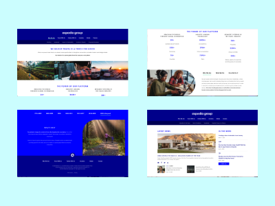
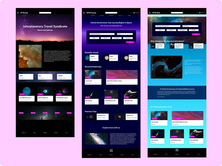
ipts.org, an informational website where you can find the latest news and happenings with the IPTS
IPTS Travel, a website where you can browse and book travel to and from multiple destinations within our galaxy. Like Expedia for space.
IPTS Rail, a real-time updated web app where you can view lines, routes, and times for all the different commuter lines. Think NYC subway or the London Underground, but for interplanetary travel.
Your job is to create all three websites. Each website has to be at least 1 page (you can make more if you’d like), but each page you make has to have at least 5 components on it. Because you’re smart, you know that a design system will likely help you with this effort, so you decide to make one in the center of all this, even though no one asked you to or assigned this task to you.
Phase 2
Leadership at the IPTS—the Interplanetary Travel Syndicate—just hired the prestigious branding firm MegaBrand to do a rebrand of the entire organization, and there are a few things that’ll affect the three products.
MegaBrand discovered through focus groups that the IPTS name and logo felt very ominous, like it was a cold, faceless corporation that was always watching.
In addition, the IPTS wants to appeal to a younger demographic.
After weeks of research and exploration, they’ve settled on the new name “Shuddle,” which feels more like a cool, new startup.
Research
Once I received the brief for phase 1, the first thing to do was the research. This is to better understand the general layout, some typical components of a website for travel. Using these researched layouts and features, helped me to narrow down what design I would need to wireframe. I was able to spot some key patterns and styles to these sites and it influenced my end result.


Wireframes
I created the general layout hierarchy of the pages, then labelled the sections within. I took inspiration from our hot potato process and gave each of the components an individual colour. This was slightly different from a usual grayscale wireframe. I decided to do this to allow a faster visual breakdown of the components I would need. Having a colour dedicated to each of the components allowed me to quickly assess what my core 5 components would be, while creating the general blueprint of each page.


Design
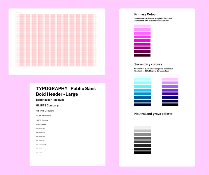
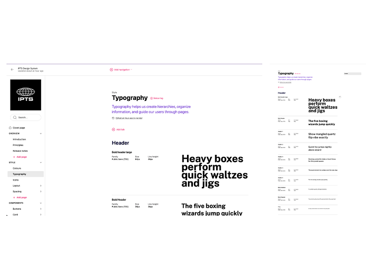
Styles - Design Tokens
Typography - Colours - Spacing rules I used design tokens on figma for my colours and typography.
This is where I began my design system file. Setting the colours, spacing and typography first to help cement the branding of the websites. I selected inspiration from galaxy print tones and natural space colours. Creating the spacing of the desktop which can be used on the webpages to keep them consistent. The colours and typography being preselected before designing sped up the component creation and composition of the website pages overall, getting to switch styles to make changes.
Components
Next step was to create the components that i had mapped out on the wireframes. These are versatile and easy to use in various interfaces.

Creating the 3 web pages
I created the 3 pages separately to give them each a more individual brand. They have similar styles and components, but I wanted them each to feel fit for purpose and have their own identity.
Using the design system to drag and drop, variant settings to switch it up and using copy text to set the pages up efficiently was very enjoyable.


Documentation
While designing on Figma, I took notes and screenshots along the way to help build out the documentation for the design system. The documentation provided guidelines for designing, and a reference for how to utilise the Design System's component library.
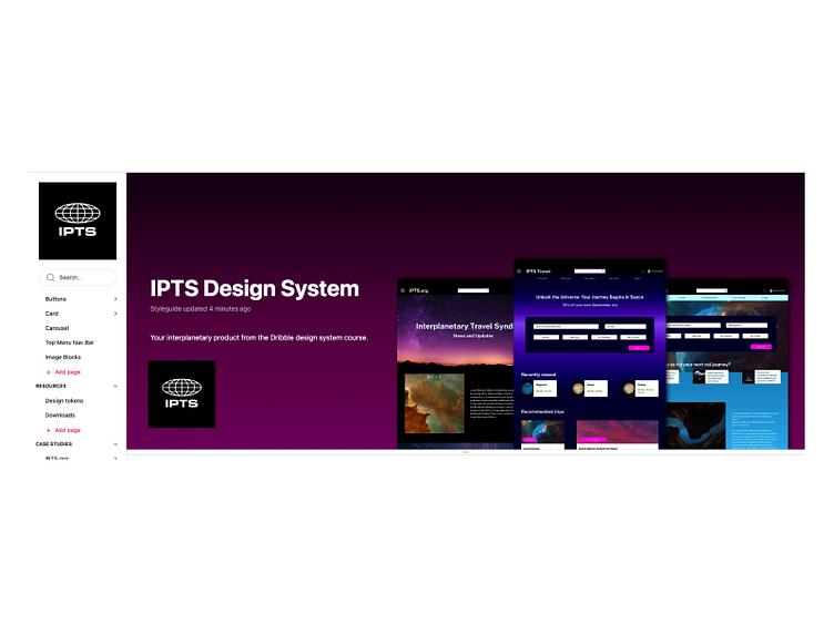
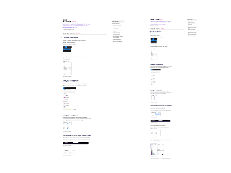

To view this documentation - go to the Reference site
Click the IPTS Archive section to view the phase 1 website.
Rebrand!!!
Style
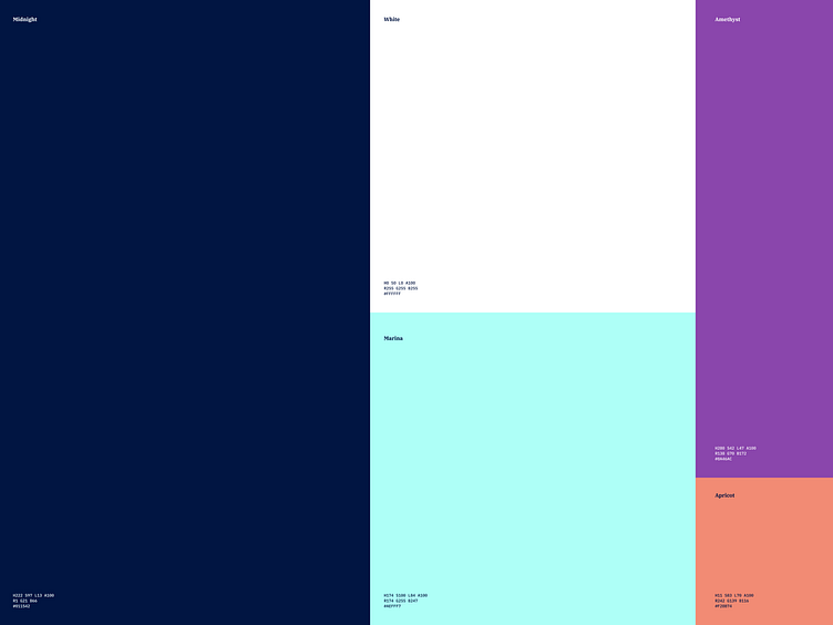
The colours and typography were provided to me from Dribble to rebrand shuddle.
Strangely i found i already had a very similar palette (must have been psychic)
So I found it an interesting challenge to reinterpret what I have done in a more youthful way.
I swapped the purple to the new amethyst
Apricot became the new button colour - primary colour that was used for bright accents in general
The original blue turquoise was swapped for the new mintish hue
Midnight replaced the Space Purple 8&9
All the gradients were adjusted to reflect the changes in main 3 colours (1 primary and 2 secondary)

Components
All components colours were adjusted automatically and looked great with the rebrand.
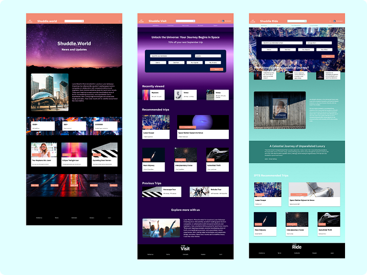
The stock imagery for the IPTS project no longer matched my aesthetic for younger travelling demographic. I updated this stock with many more youthful and atmospheric imagery and this reflected in the components that contained imagery.

Final Result
This final rebrand was a nod to music culture, futurism and 60’s retro.
The 3 websites automatically updated to suit this change. I rebranded the logo where necessary.
Some of the content was adjusted where necessary.


Shuddle reference site
The updated reference site can be found here: Shuddle Reference Site

Reflections
I really enjoyed watching the seamless change of branding. The quick production of the website. Using space as a theme was interesting, we have not started space travel yet and who knows what the branding of that will be. Makes you look at space in a new way, rather than stereotyping space as only galaxies and stars.
Updating the documentation site on zeroheight did not let you do it in one go which was difficult to go through and find them all. Getting the detail and making changes, then applying them to all the screenshots through the project was exhausting but does result in a beautiful outcome. I was able to improve my customisation of singular components to have multiple variants to reduce the amount of components required. Learning to think about how one component could be transferable across a platform, and that they are the best type of component to keep within a system.
Finally I enjoy dipping my toes into the coding world:)