Crinkle Branding | A brand of organic products

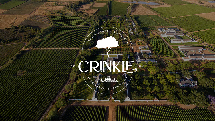
Crinkle a brand of organic products with a first-class approach to growing organic products and a solid reputation that was established in 1986. Their brand grew from their own family farmstead and eventually developed into a national company supplying fresh and high-quality vegetables, fruits and herbs.
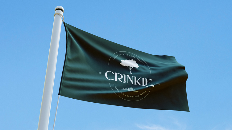
🌱 Logo
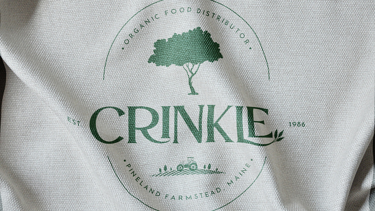
The brand logo is designed in the format of the family coat of arms.
The apple tree is the main symbol of the estate. It was with the apple harvest that the marked the beginning of the Crinkle as brand in 1986. Since the end of the 20th century, the harvest gathered from the farmstead accounted for 70% of all vegetables and fruits on the American market.
🌱 Target Audience
Crinkle is targeting Millennials, individuals, and families whose income is well above the national average, who lead a healthy lifestyle, and who are environmentally conscious.

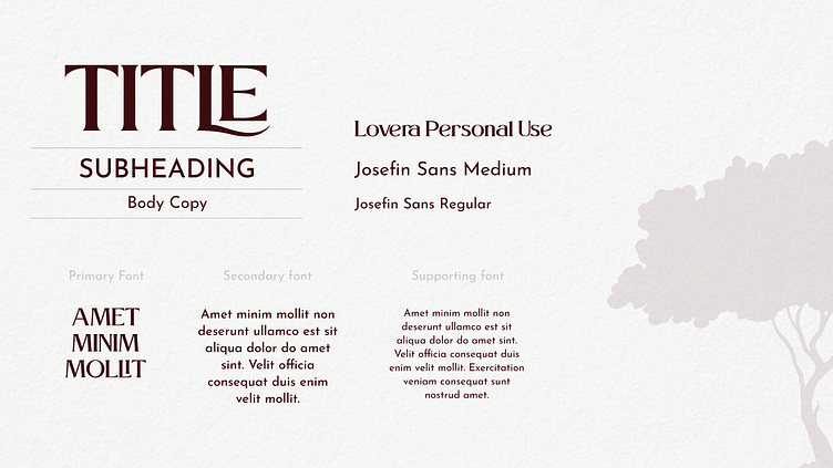
🌱 Typography
Crinkle is targeting individuals and families whose income is well above the national average. Therefore, the main characteristics of the brand's font combination are: elegant, organic, classic, familiar, and discreet.
To make the brand memorable, we have diluted some letters of the font with handwritten parts, such as the tail of the letters R and L, as well as a tree branch at the tip of the letter L. This combination of strict and smooth lines creates a delicate balance:
• Rigor = reputation, high quality, long history
• Softness = nature and its natural curves.


Want to work with me?
If you want to build a strong and consistent personal brand, rejuvenate your product, and strengthen communication with customers, don’t hesitate to reach out to me via DM so that we come up with a project that will wow and be remembered.